MARAKALAM.
[UI/UX Design]
A fleet command centre for logistics teams: live vehicle tracking, incident response, shipments, drivers and maintenance in one dark, glanceable workspace
[Type]
Self-initiated case study
[Role]
UX research, IA, UI design, design system
[Platform]
Desktop web dashboard
[Tools]
Figma, Spline 3d
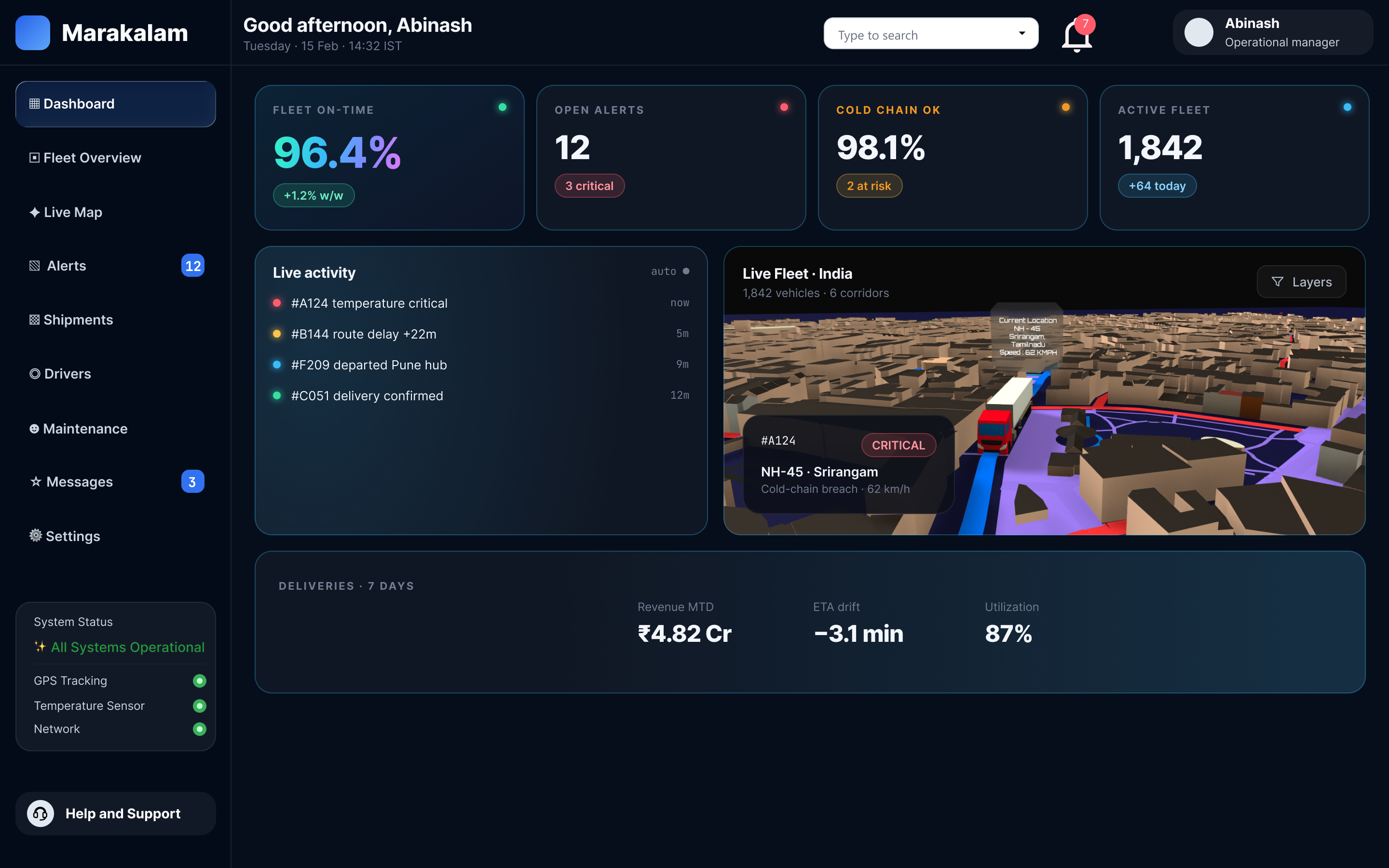
Dashboard. Fleet uptime, active alerts, on-time rate and shipments sit above the live activity feed and 3D map.
Marakalam
The sign-in carries the platform brand; everything past it is the Marakalam workspace, a persistent sidebar with eight modules
The problem
What are dispatchers juggling?
A single delayed truck can involve a GPS screen, a telematics portal, a maintenance log, a shipment spreadsheet and a phone call. The information exists. It just lives in five places.
[Challenge]
Operations teams need to spot what's going wrong across a whole fleet in seconds, then act on one vehicle without losing sight of the rest.
[Goal]
Design one workspace where status is readable at a glance, alerts are ranked by severity, and the path from "something's wrong" to "driver contacted" takes as few steps as possible.
Who it's for
Three roles, one screen
I designed around the three people who'd have Marakalam open all day. Their needs set the priority of every module in the sidebar.
Fleet dispatcher. Watches the live map and alerts, reroutes vehicles, calls drivers. Needs severity at a glance and one-click contact.
Fleet manager. Tracks uptime, on-time delivery, driver performance and fleet health across the week. Needs trends and KPIs up front.
Maintenance lead. Plans servicing before breakdowns happen. Needs upcoming service, part status and cost in one list.
[Principle 01]
Summary before detail. Every module opens on its numbers, then the list.
[Principle 02]
Colour means state. Green, amber and red are reserved for status, never for decoration.
Name & logo
From an ancient Tamil word
Every fleet is a journey, so the name had to carry one.
The mark. Used as the sidebar icon and full-size on the marakalam sign-in.
[Origin]
மரக்கலம்
marakkalam · ship, vessel
An ancient Tamil word for the ships that carried goods from the Tamil coast to faraway ports.
[01 · Word]
Tamil roots
The base structure comes from the Tamil script, a quiet nod to where the name, and the idea of trade routes, began.
[02 · Arrow]
Direction
One stroke ends in an arrow pointing forward. It stands for movement and guidance: every truck, route and shipment is heading somewhere, and Marakalam shows the way
[03 · Strokes]
Connected routes
The other strokes meet and branch like roads on a map, linking depots, vehicles and destinations into one network, just as the dashboard brings the whole fleet onto one screen.
[GOAL]
A logo that looks simple at first glance but holds deep meaning inside: an ancient word, a sense of direction and a connected network, all in one mark that still reads clearly at sidebar size.
Sitemap
Information architecture
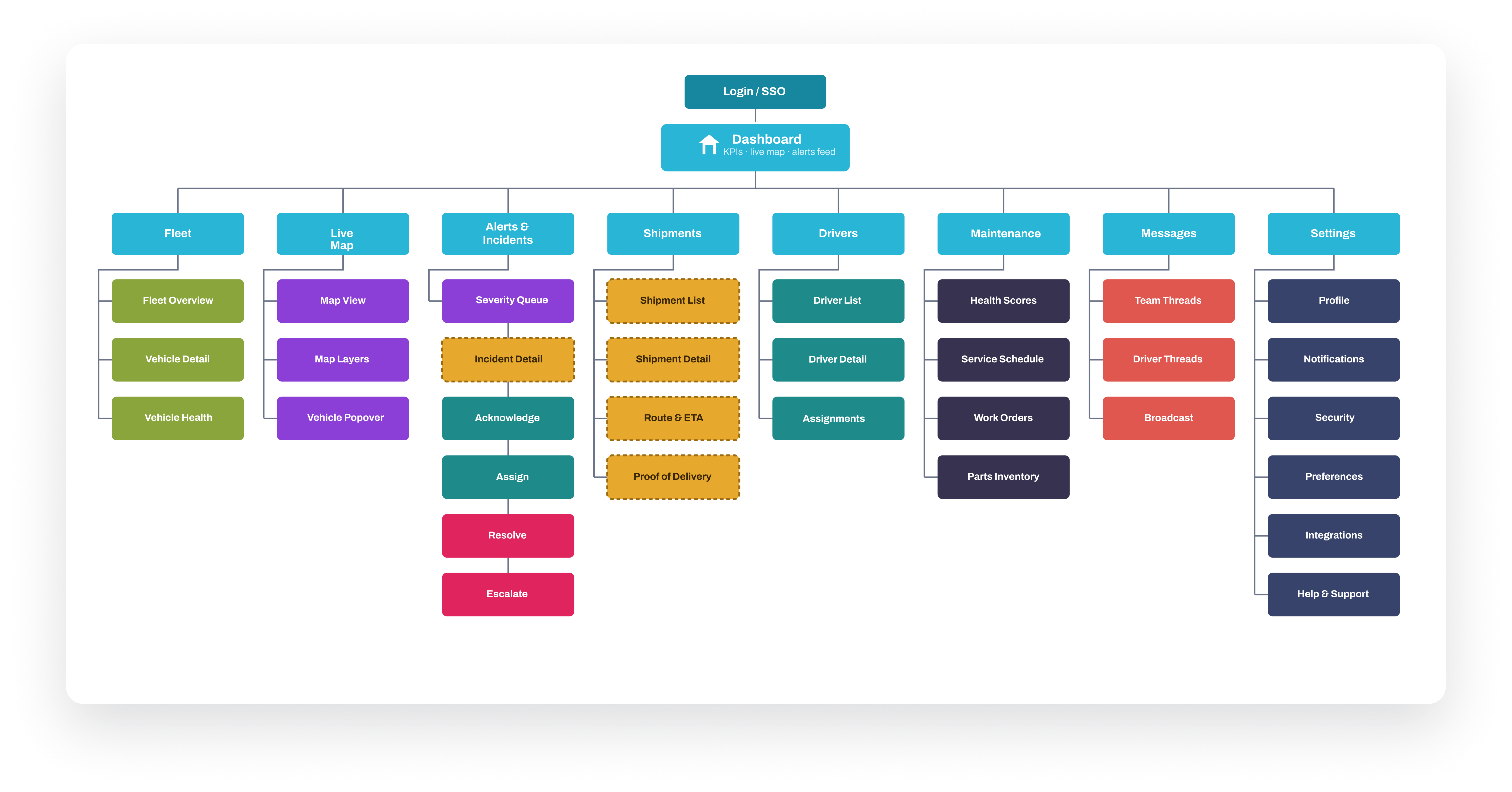
Eight modules, one level deep. Keeping the sidebar flat means any part of the fleet is one click away, and the active module is always visible.
User flow
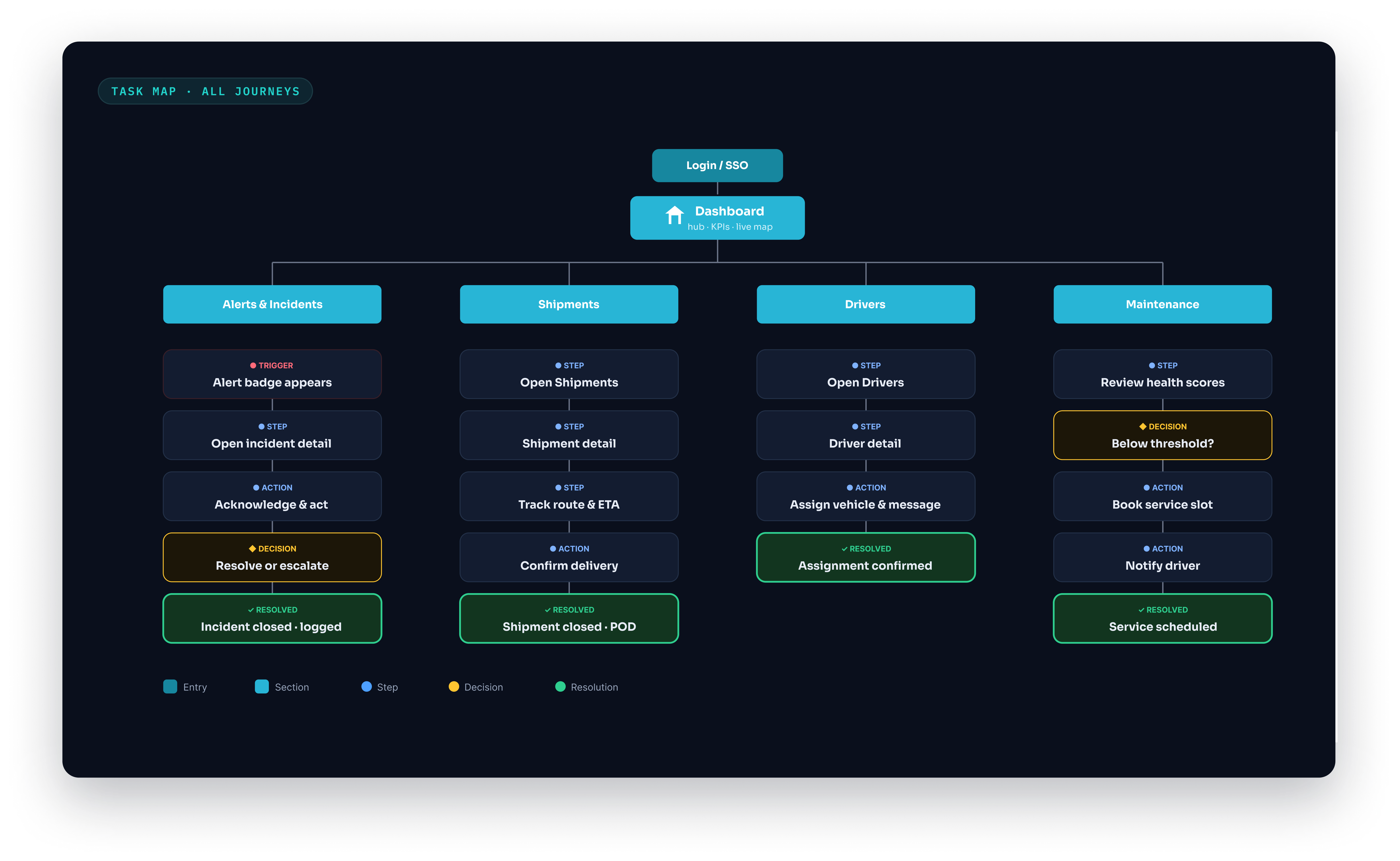
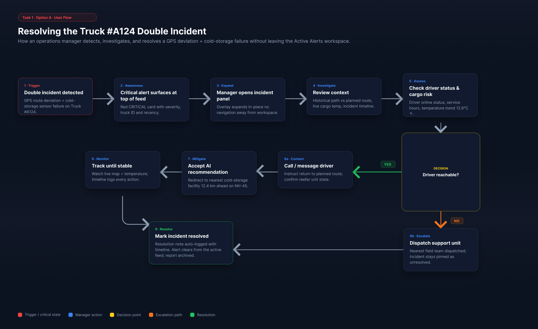
Primary task: respond to a critical alert
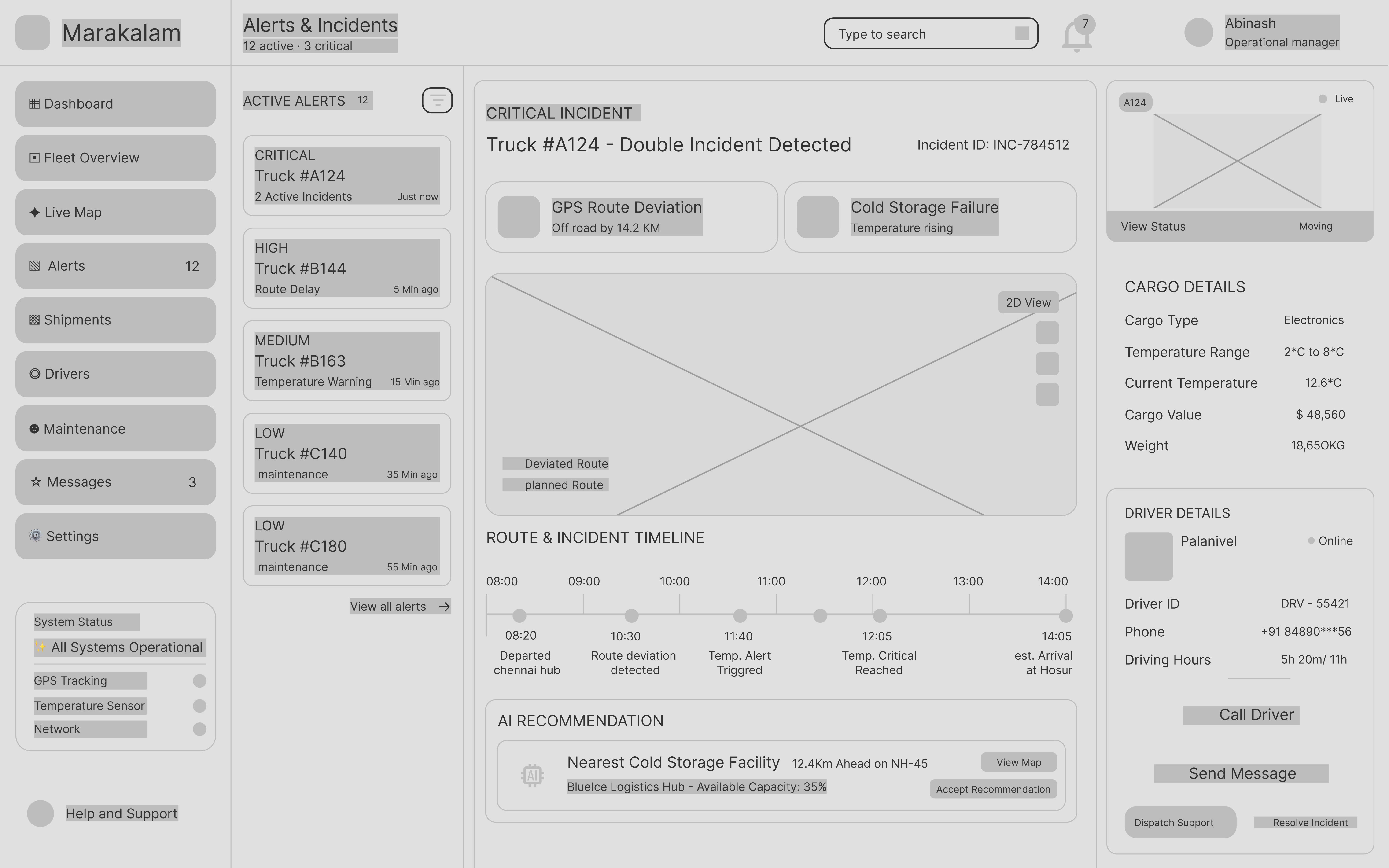
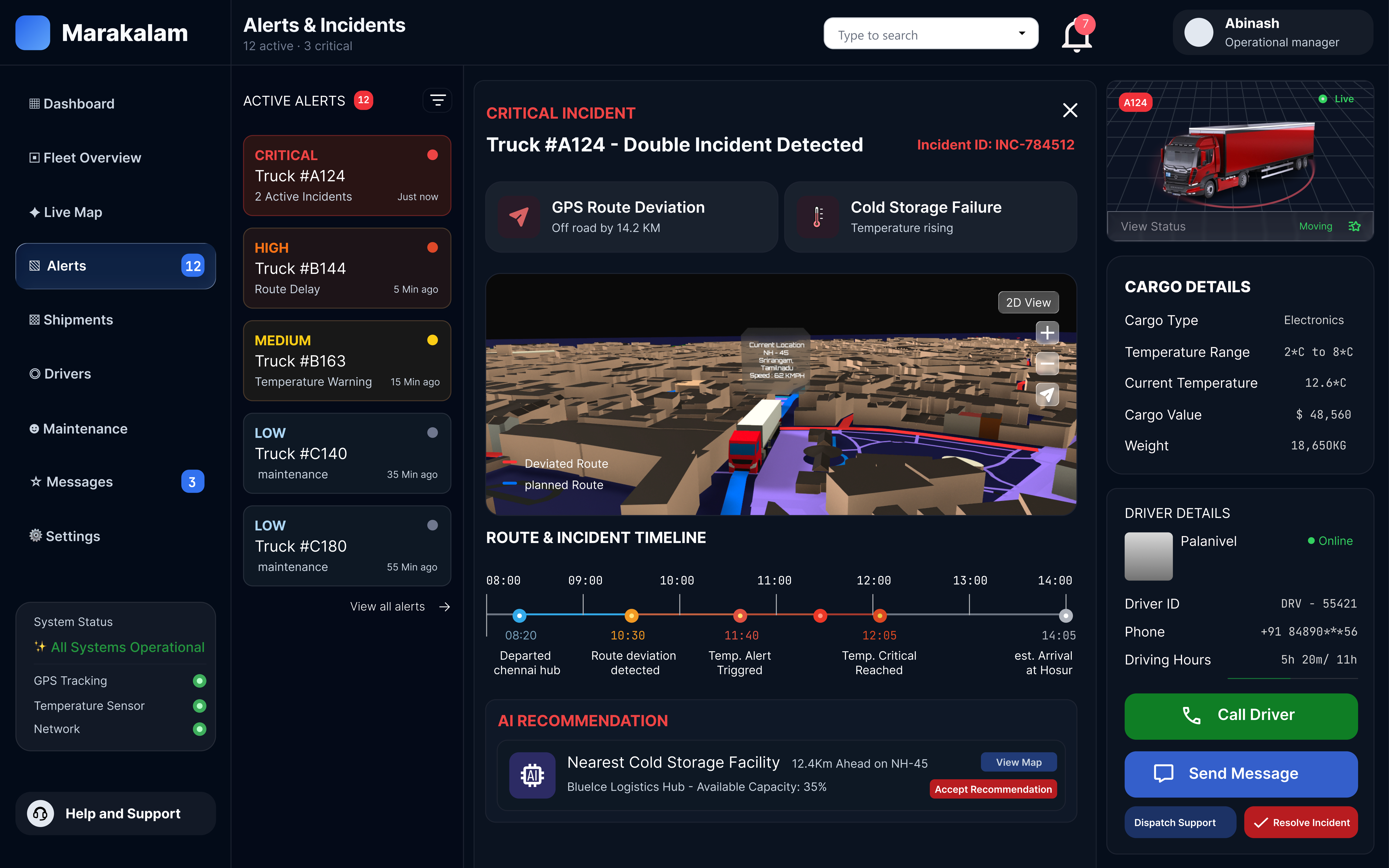
The most important thing a dispatcher does is react to an incident. I mapped that path first and shaped the Alerts screen around it: queue on the left, incident in the middle, actions on the right.
Wireframes to high fidelity
Same nine screens, three passes
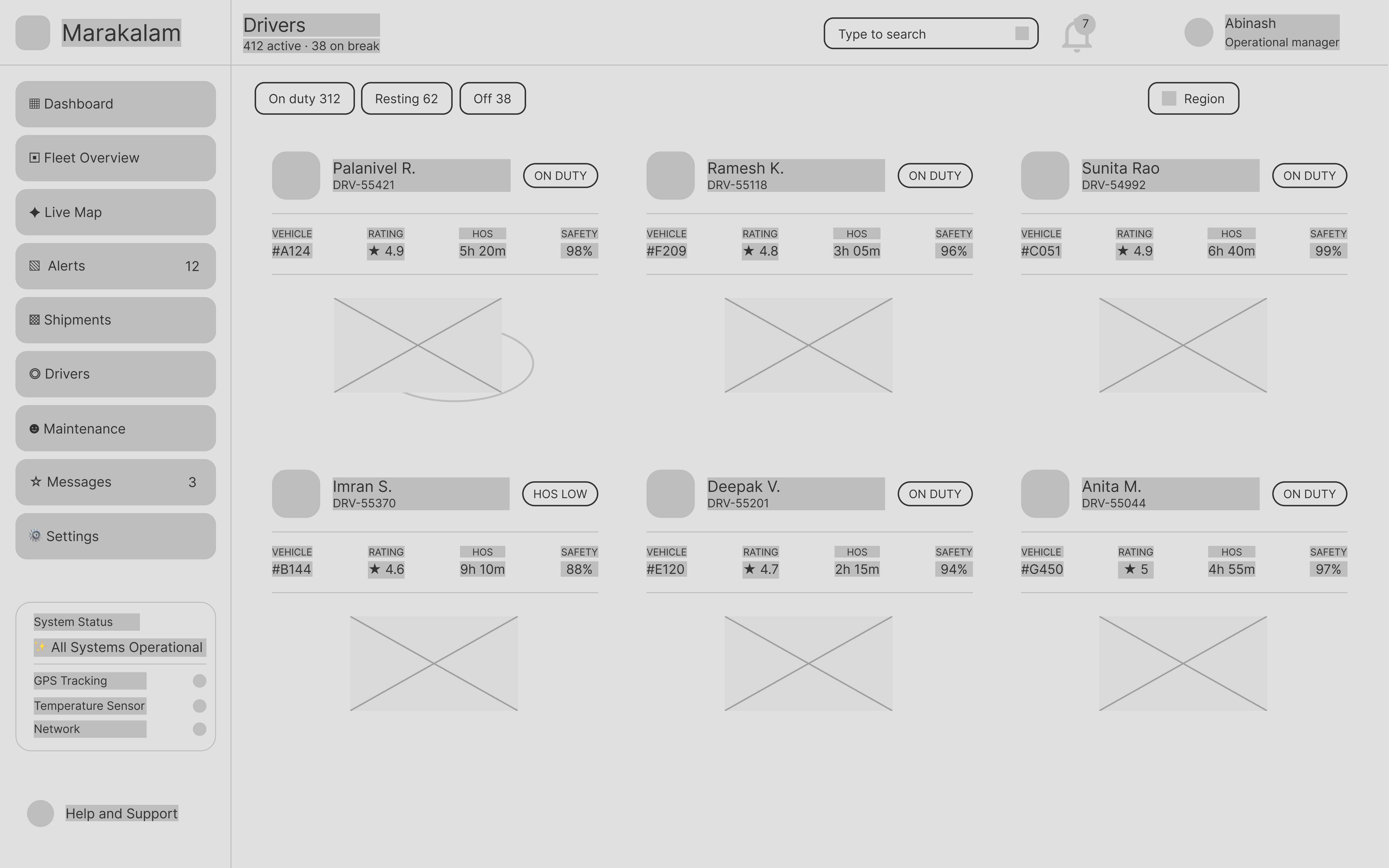
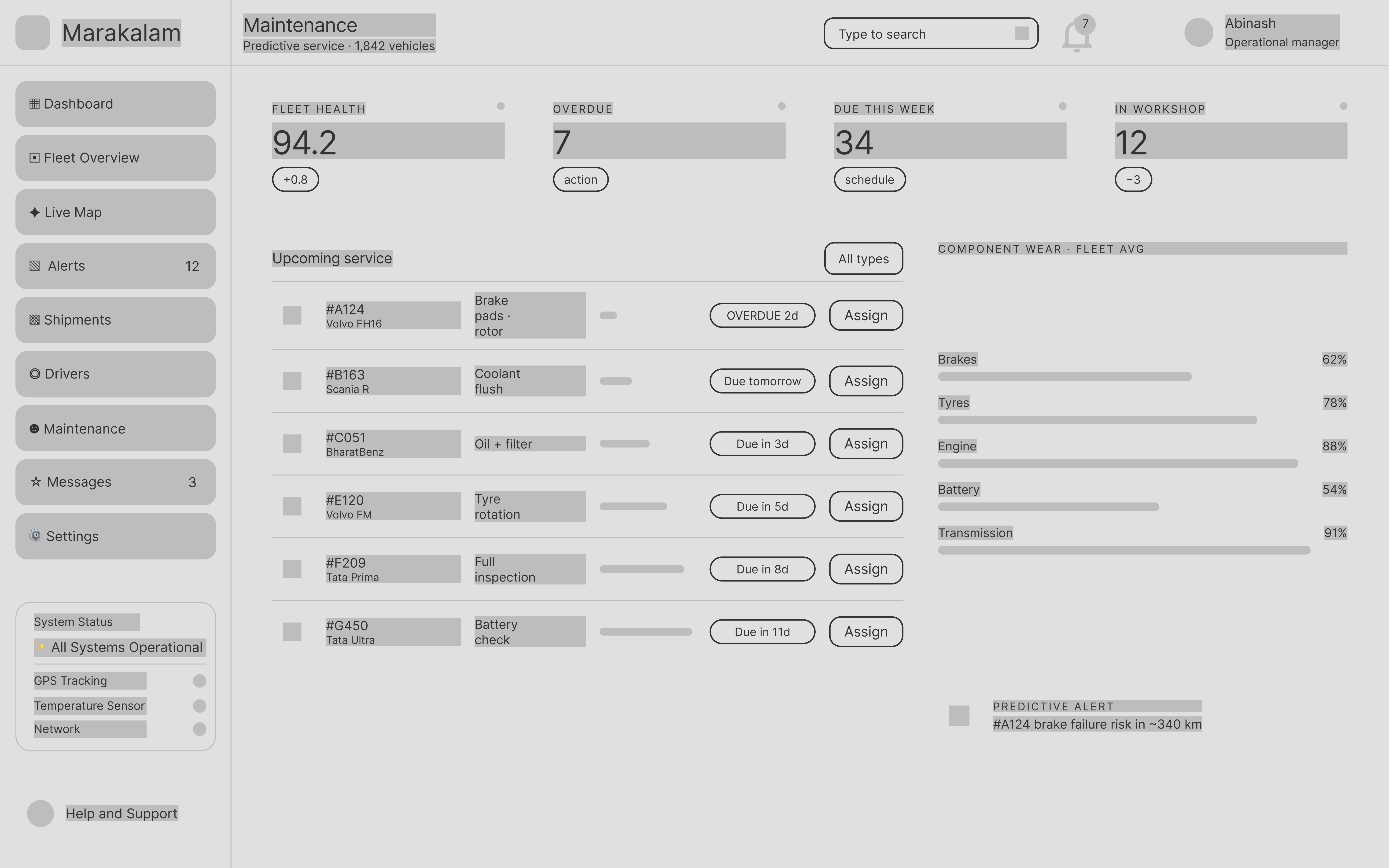
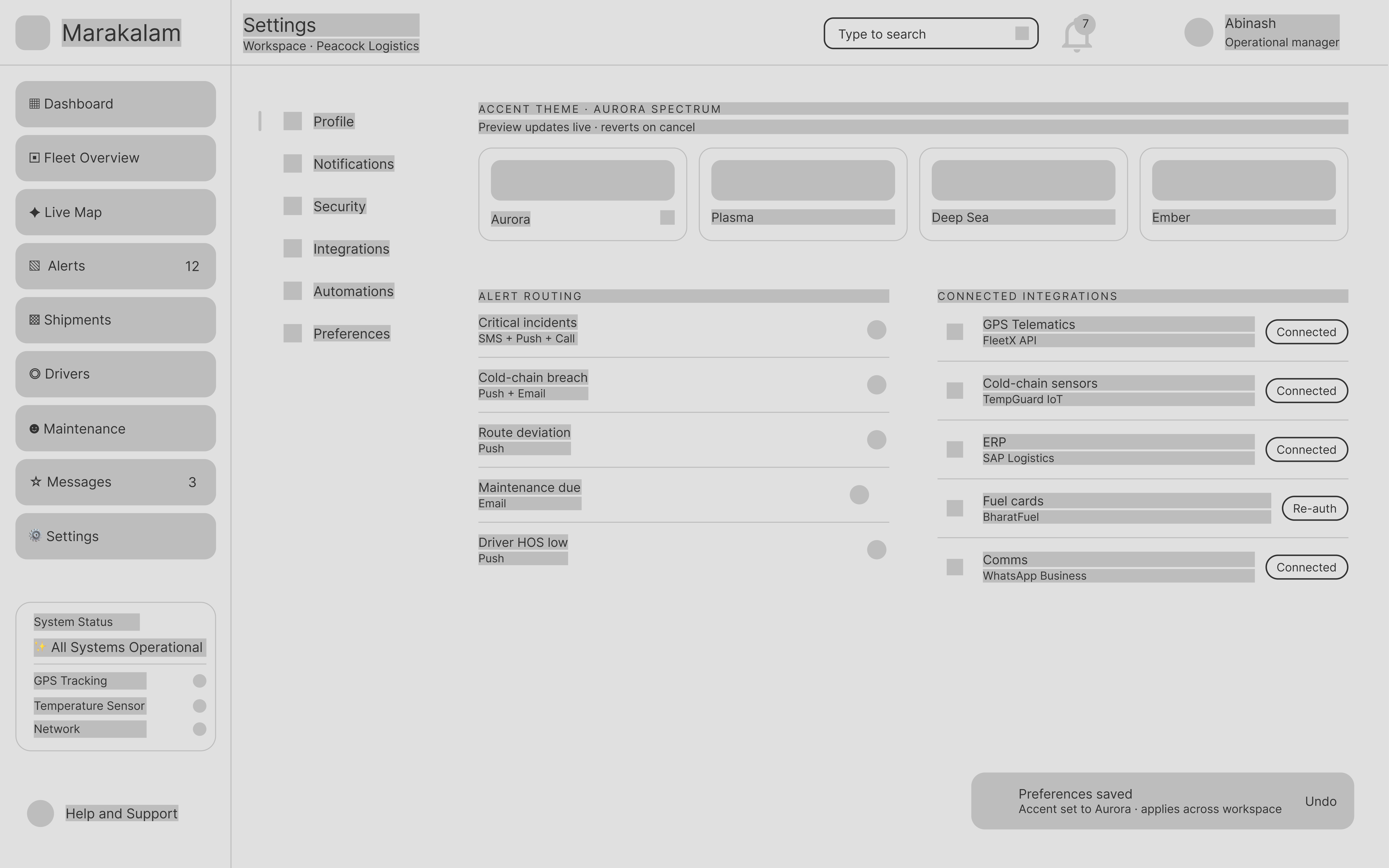
Greyscale layouts to settle structure: sidebar, KPI row and content zones, with no colour or copy to argue about.
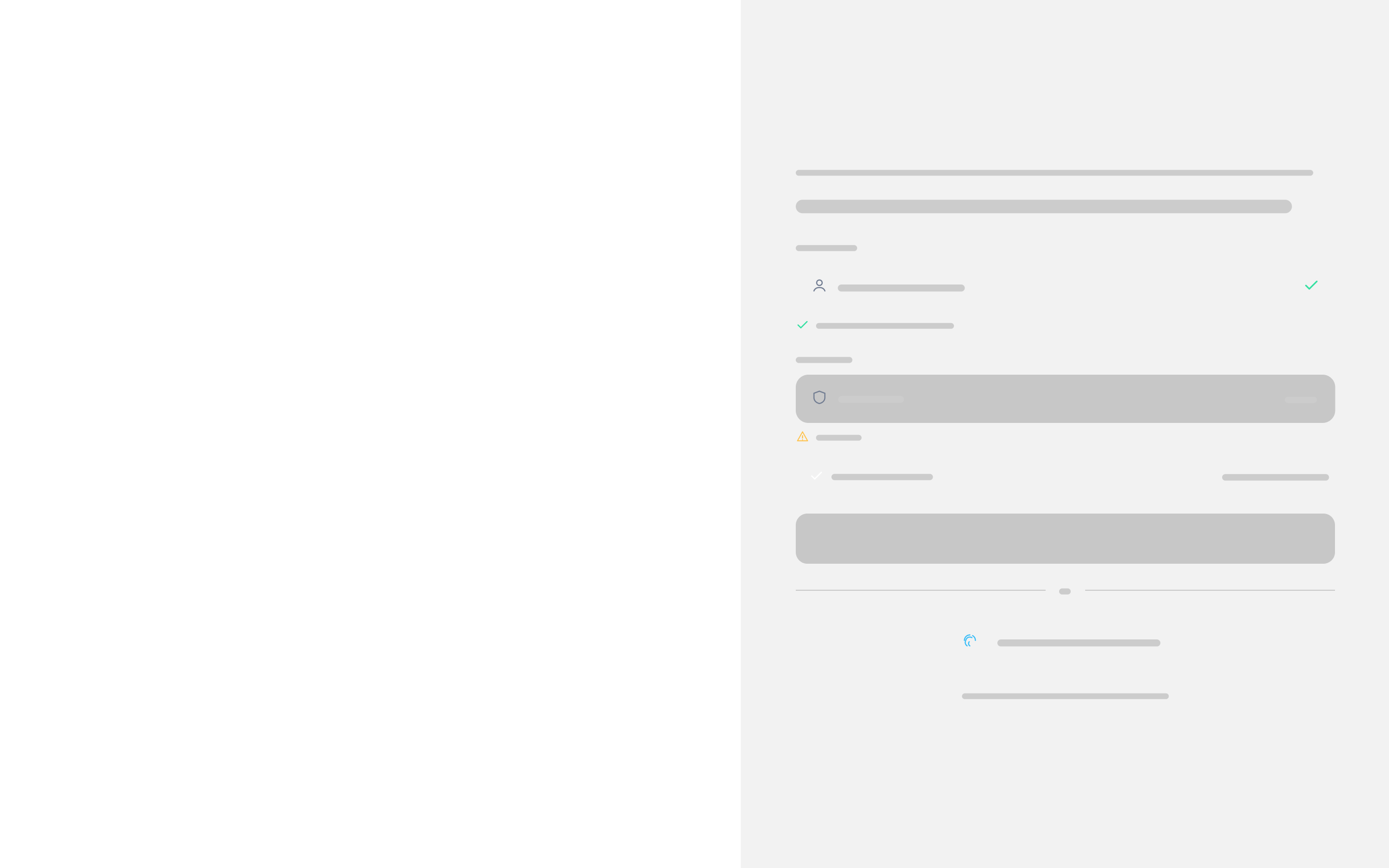
Sign in
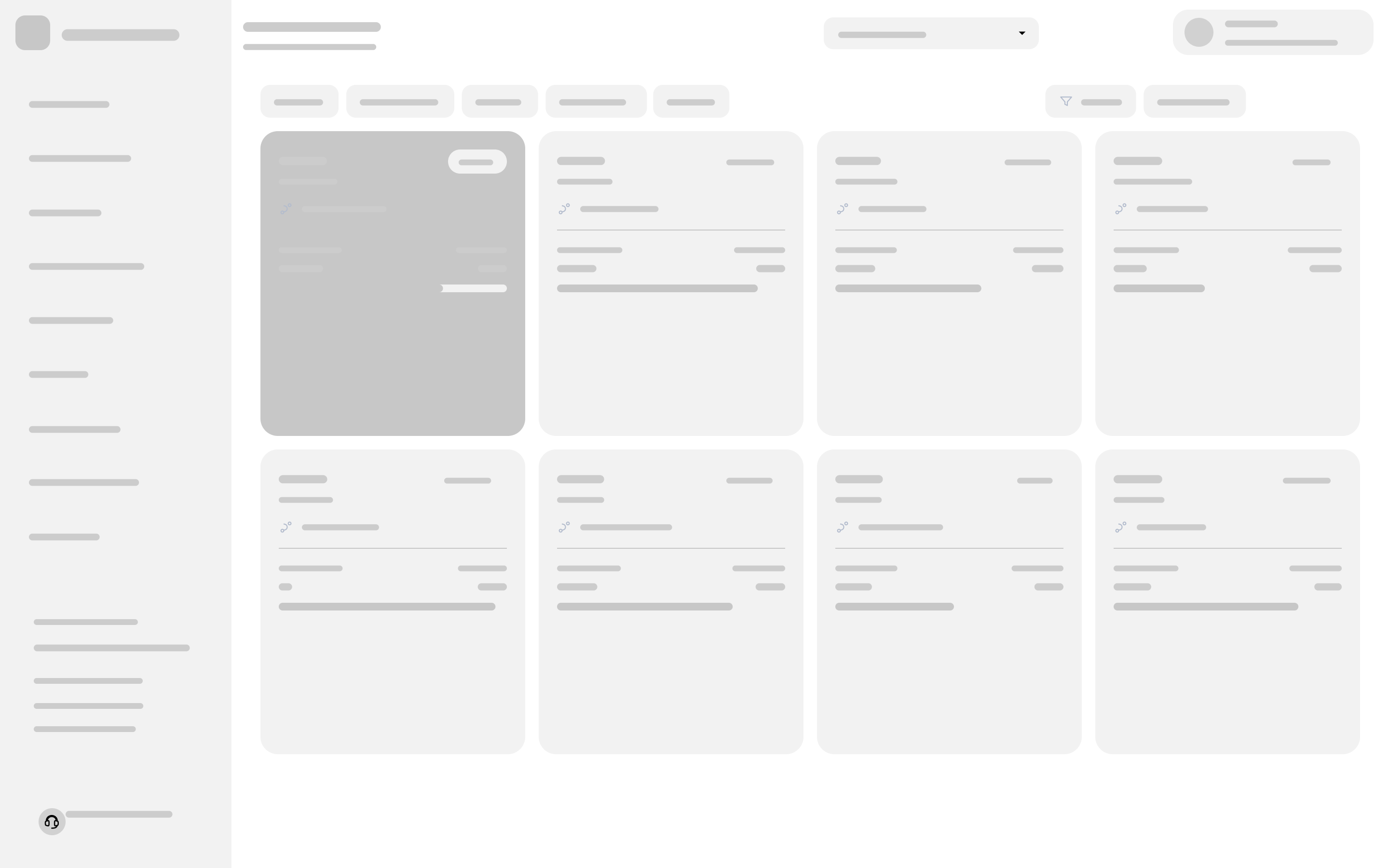
Dashboard
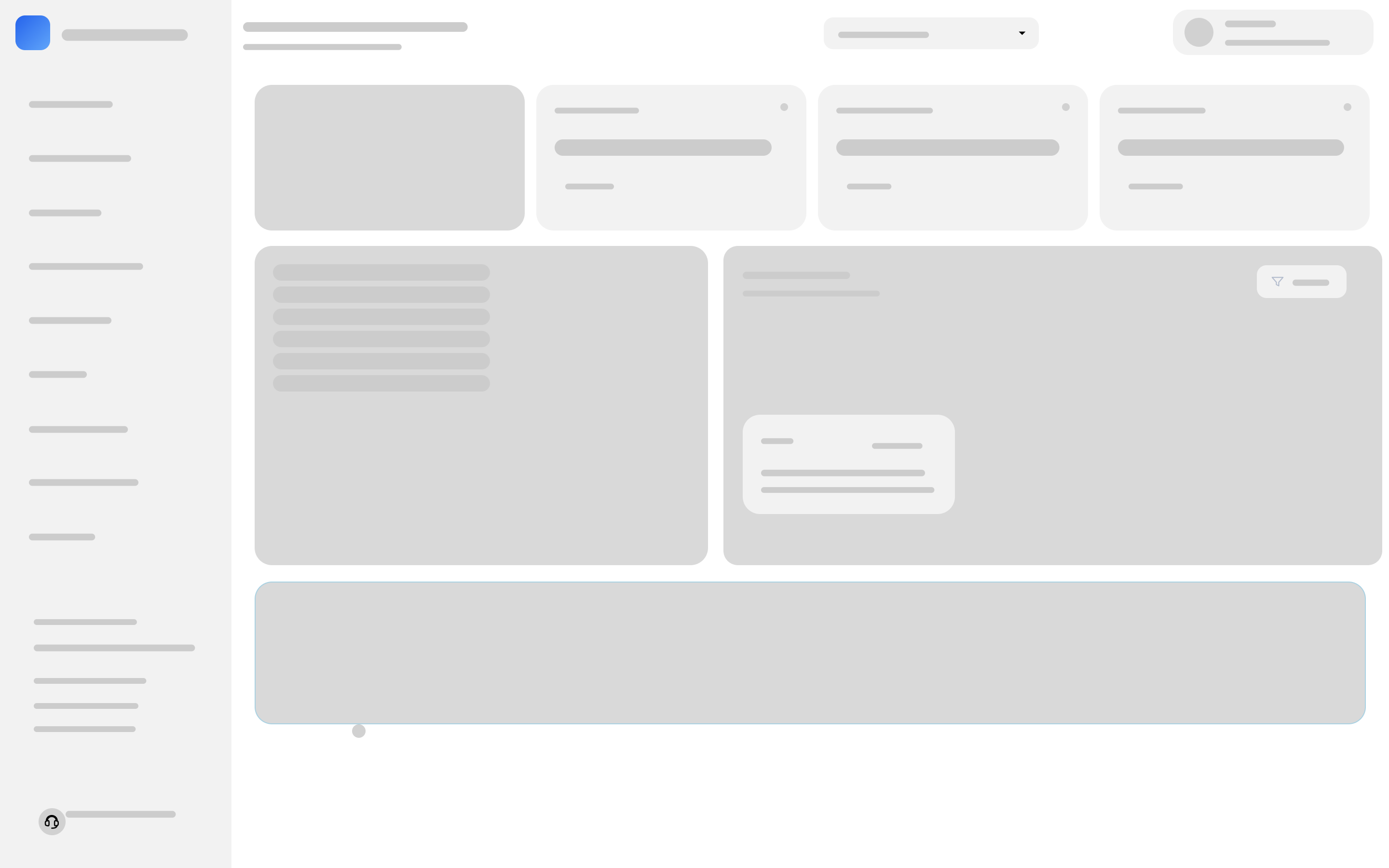
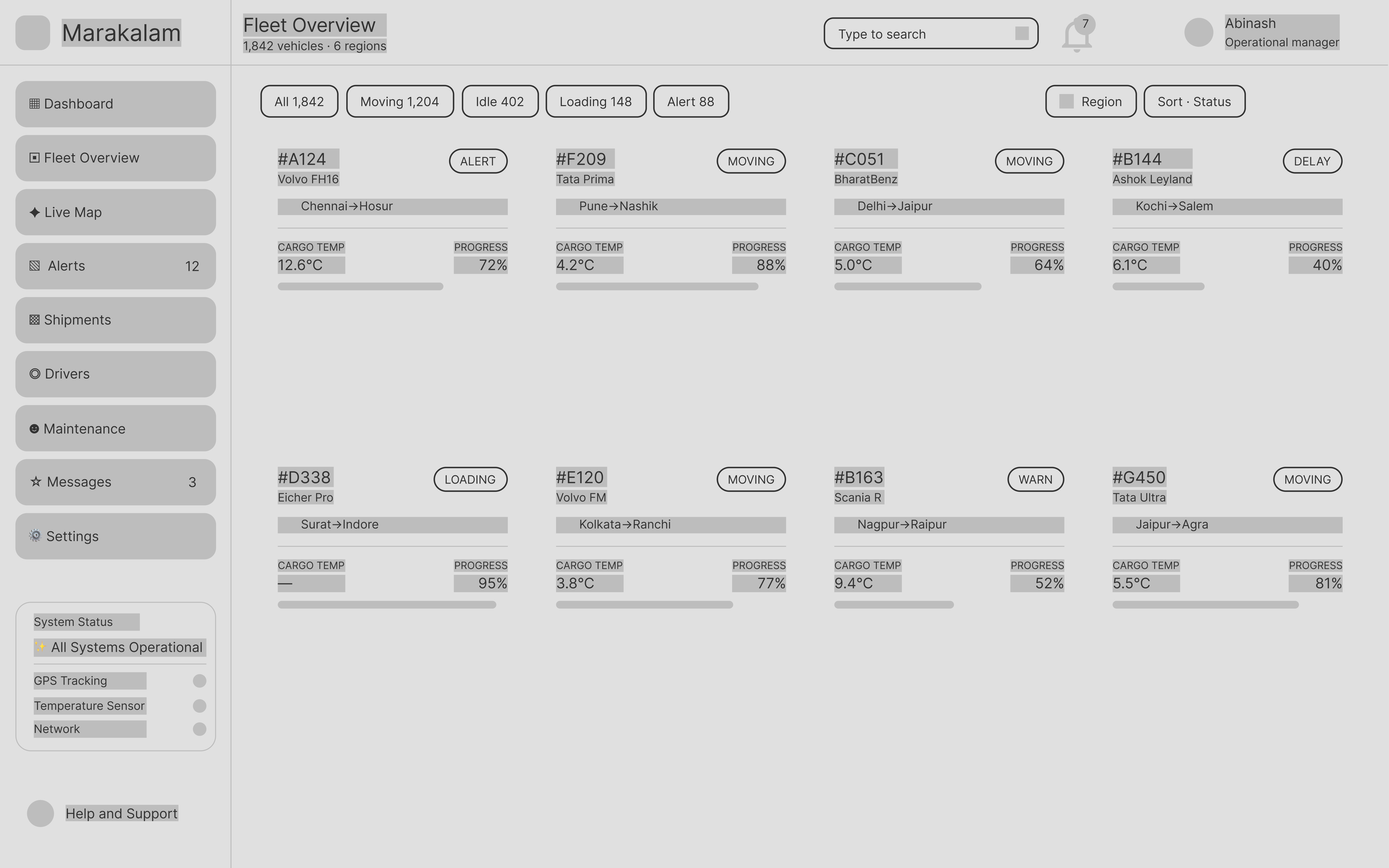
Fleet Overview
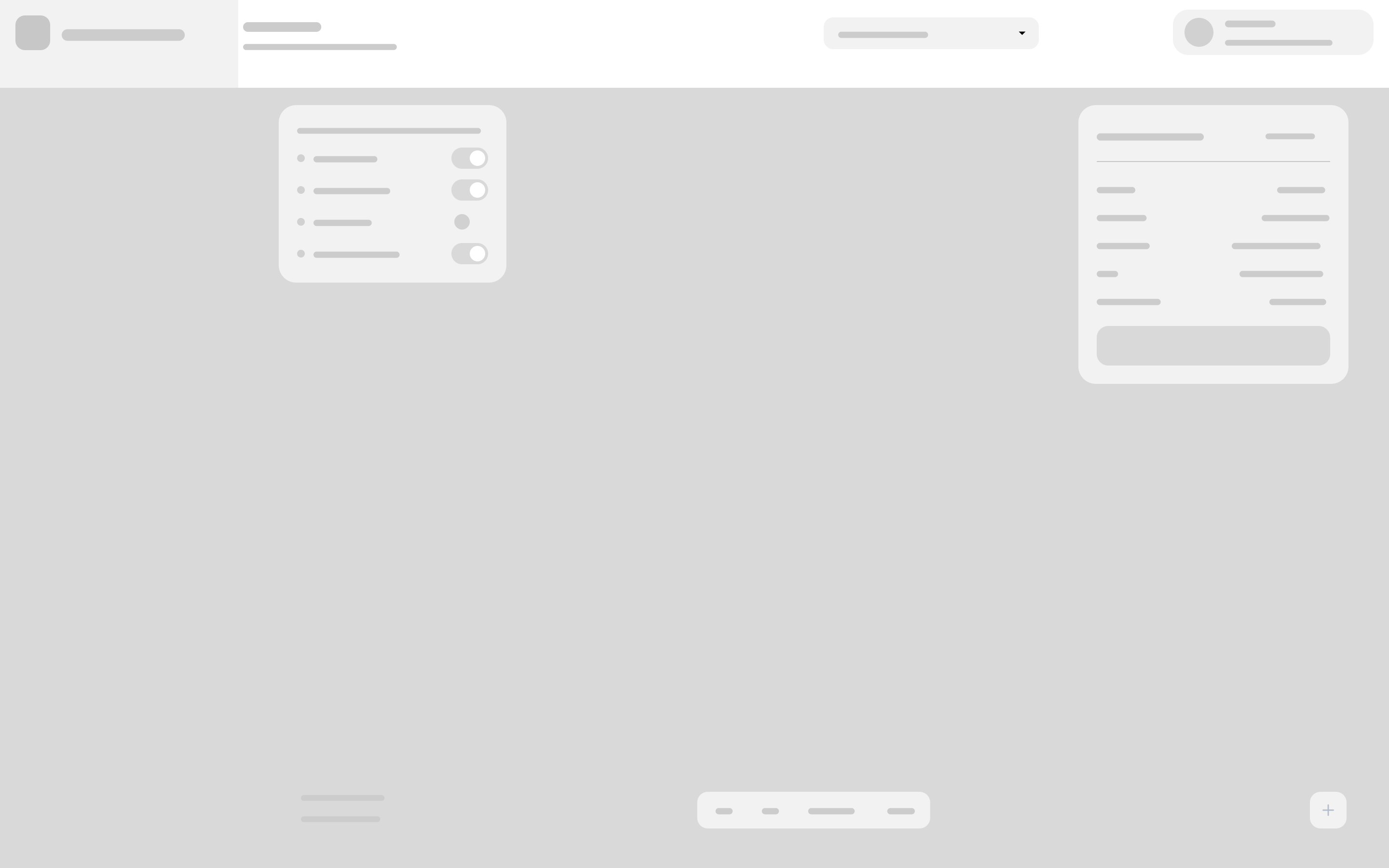
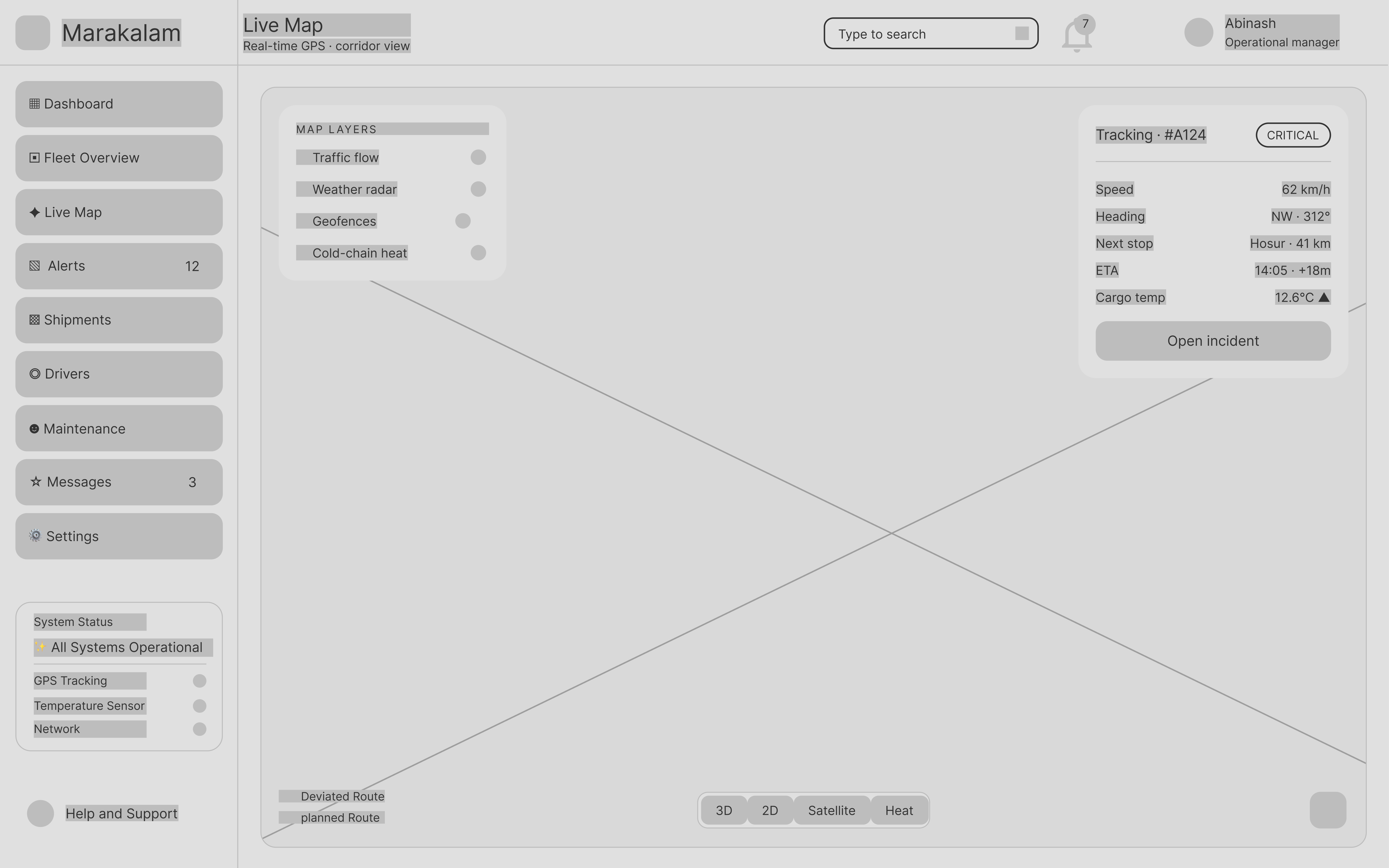
Live Map
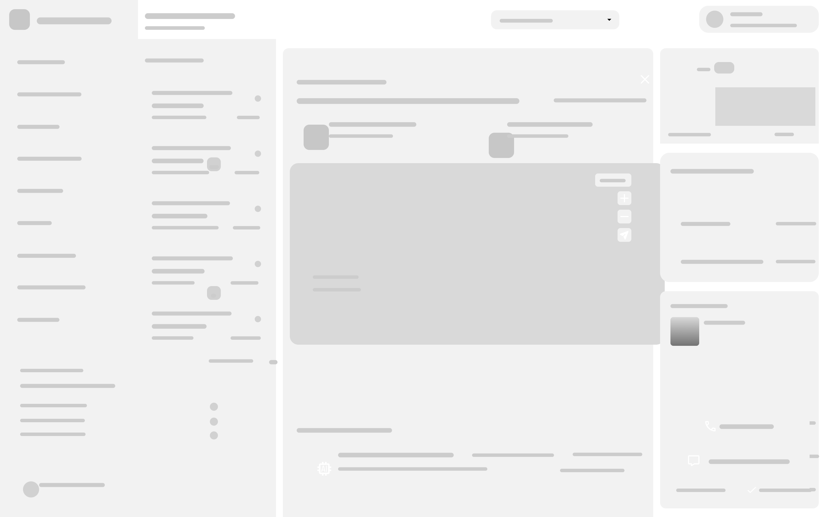
Alerts & Incidents
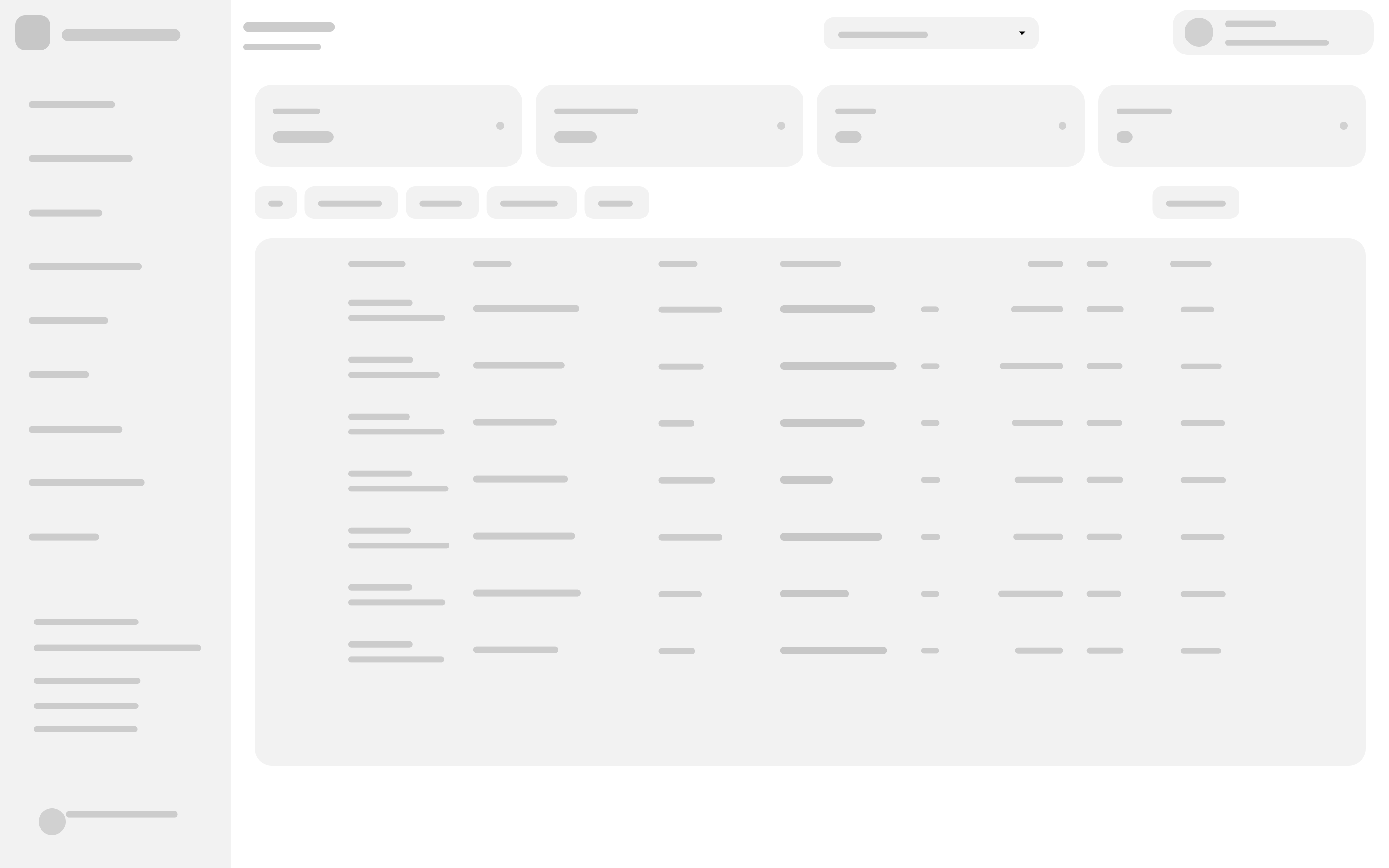
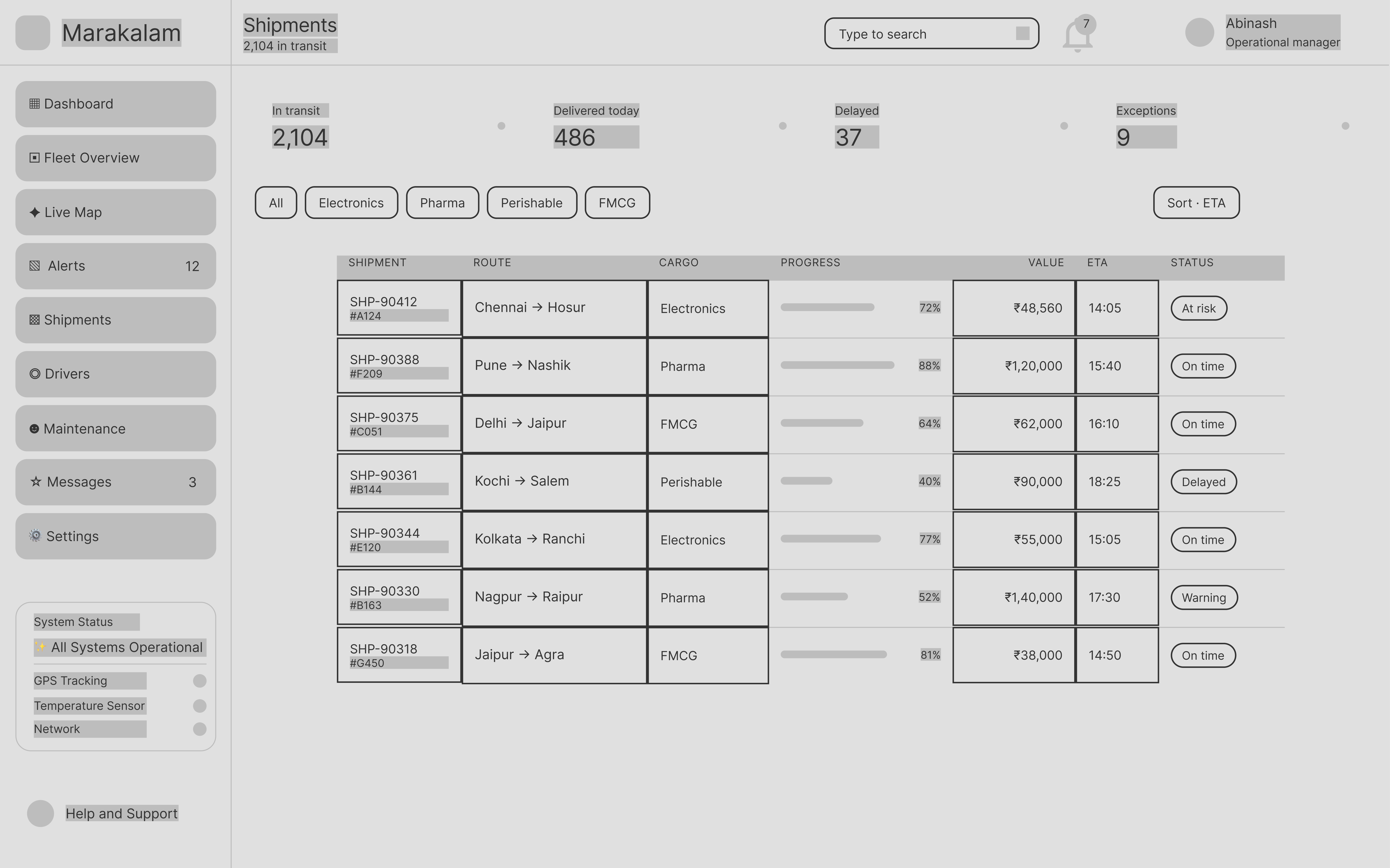
Shipments
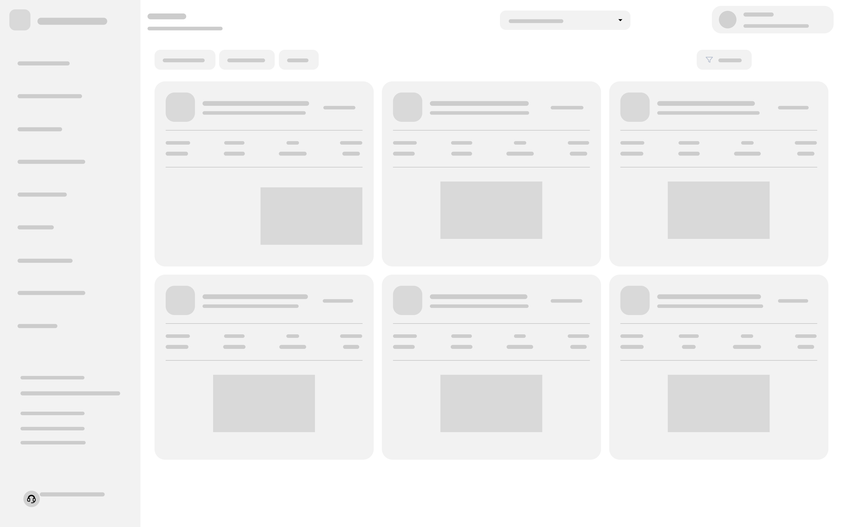
Drivers
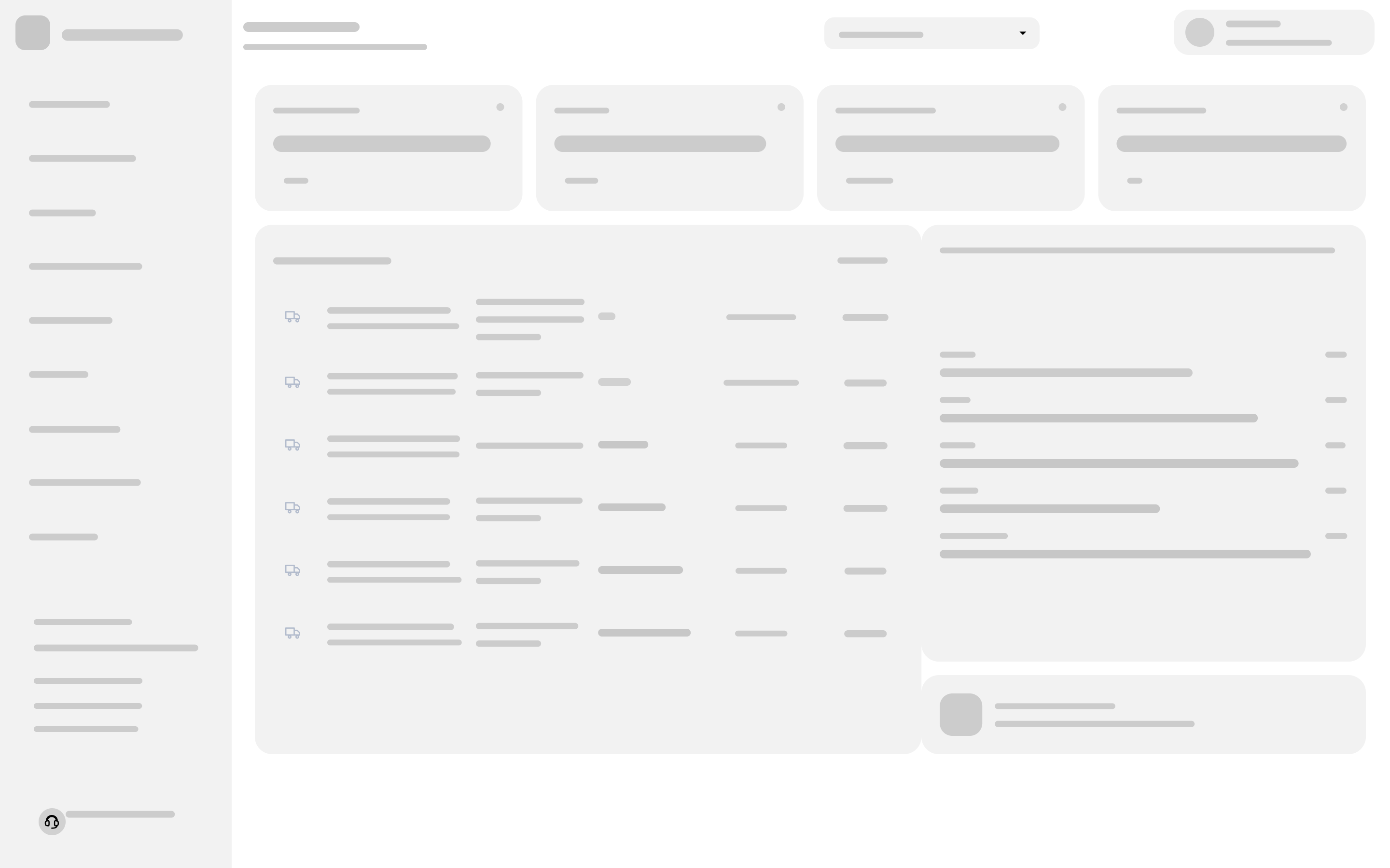
Maintenance
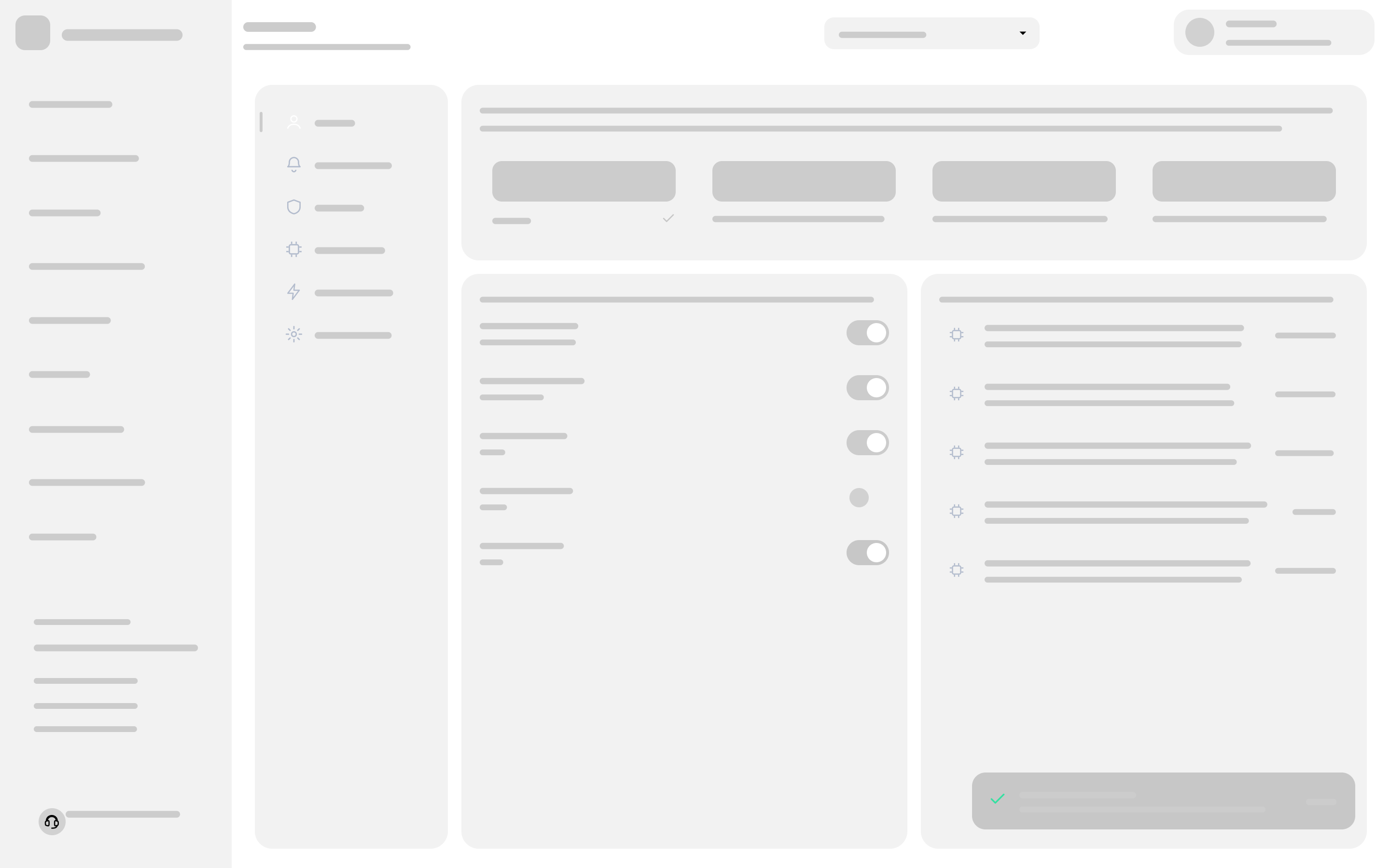
Settings
Real labels and content hierarchy. Component sizes, table columns and card anatomy get fixed here.
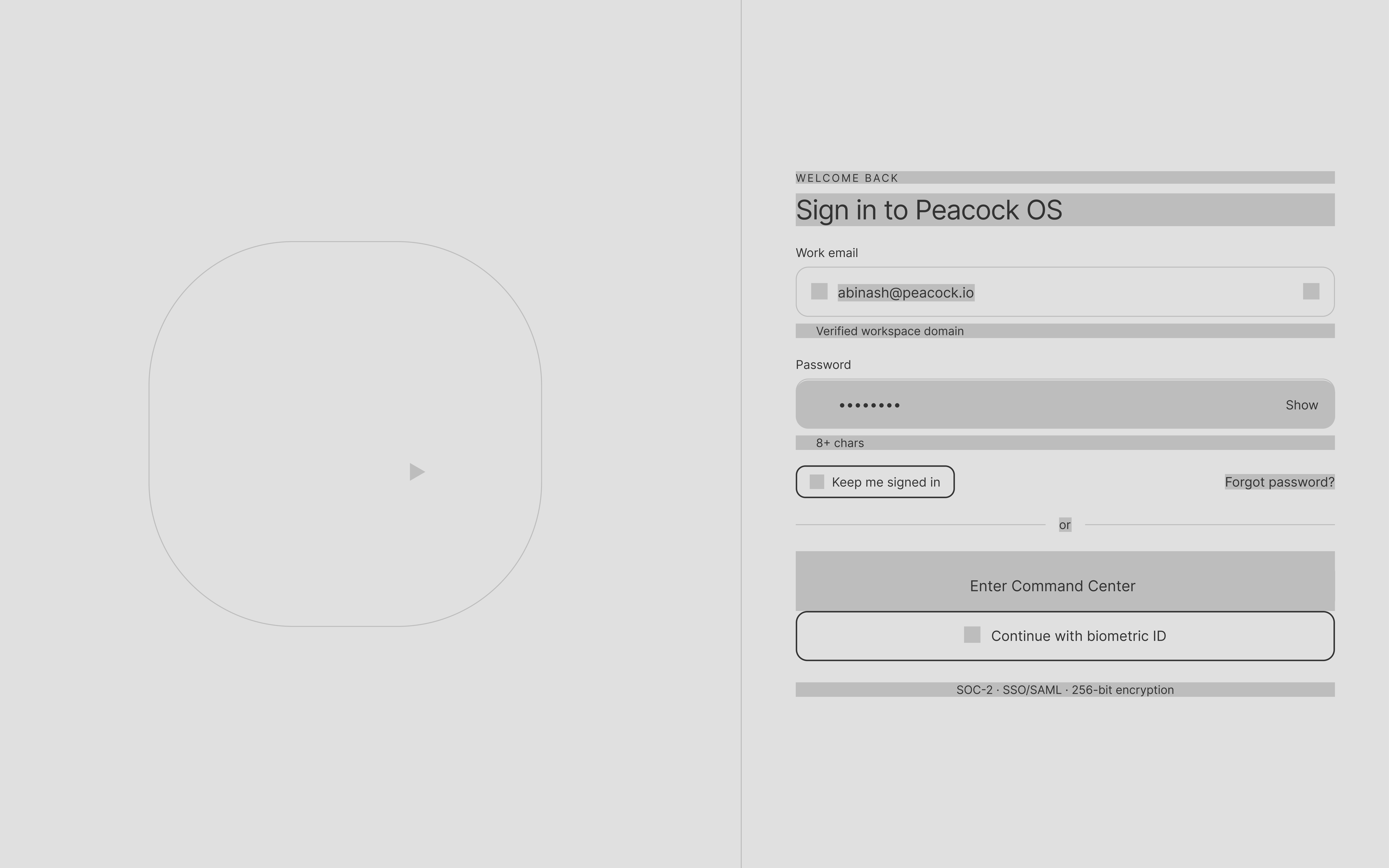
Sign in
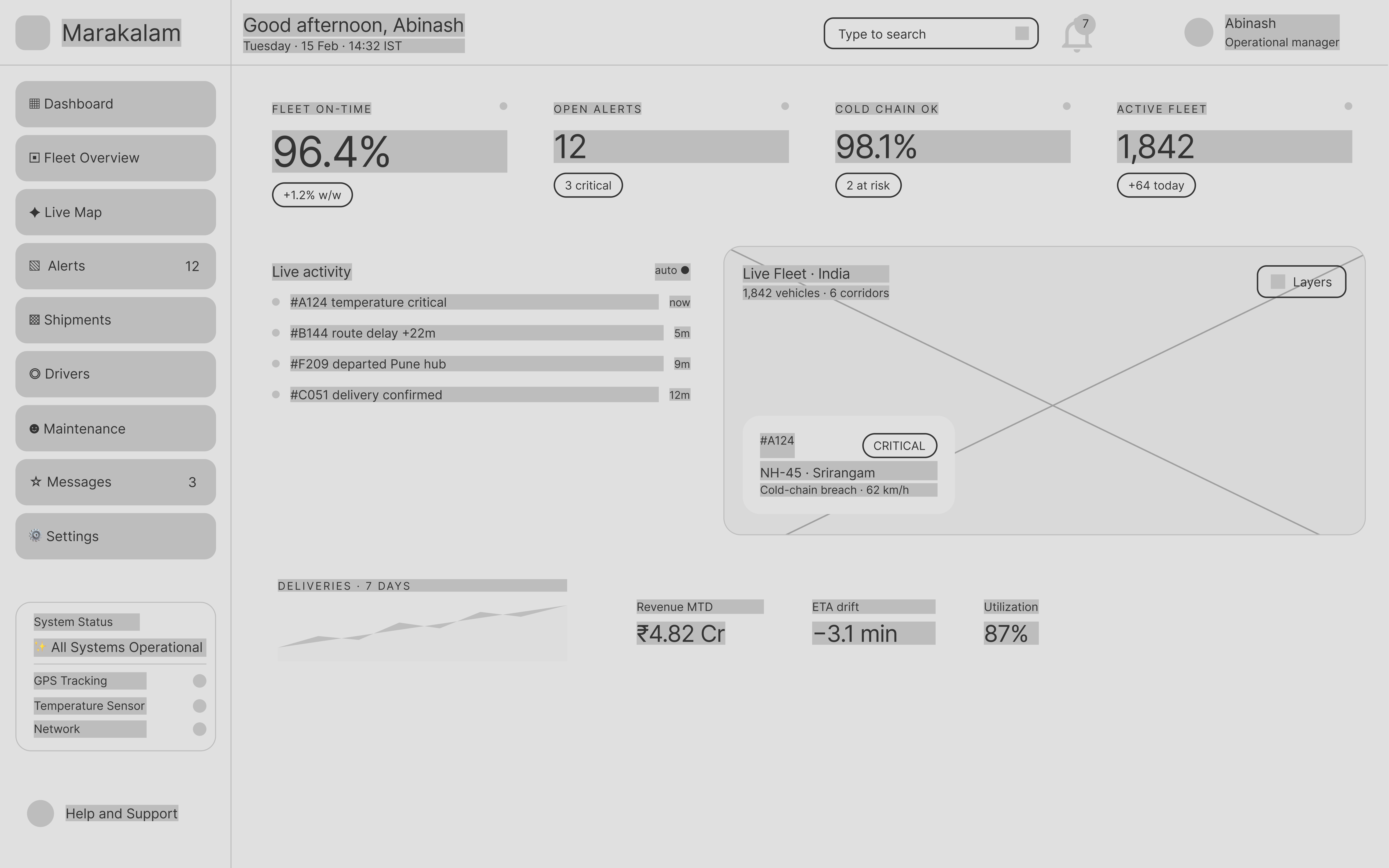
Dashboard
Fleet Overview
Live Map
Alerts & Incidents
Shipments
Drivers
Maintenance
Settings
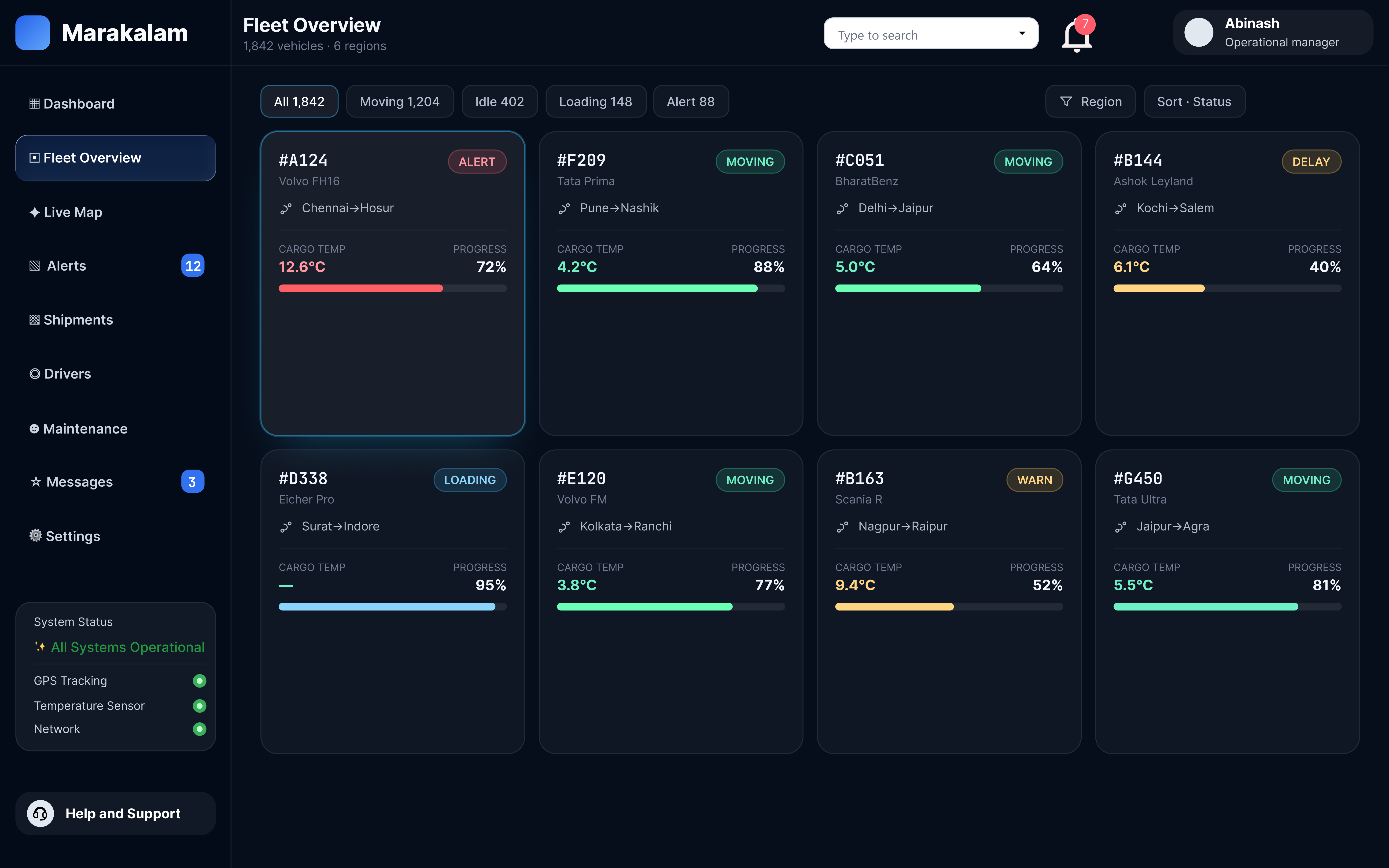
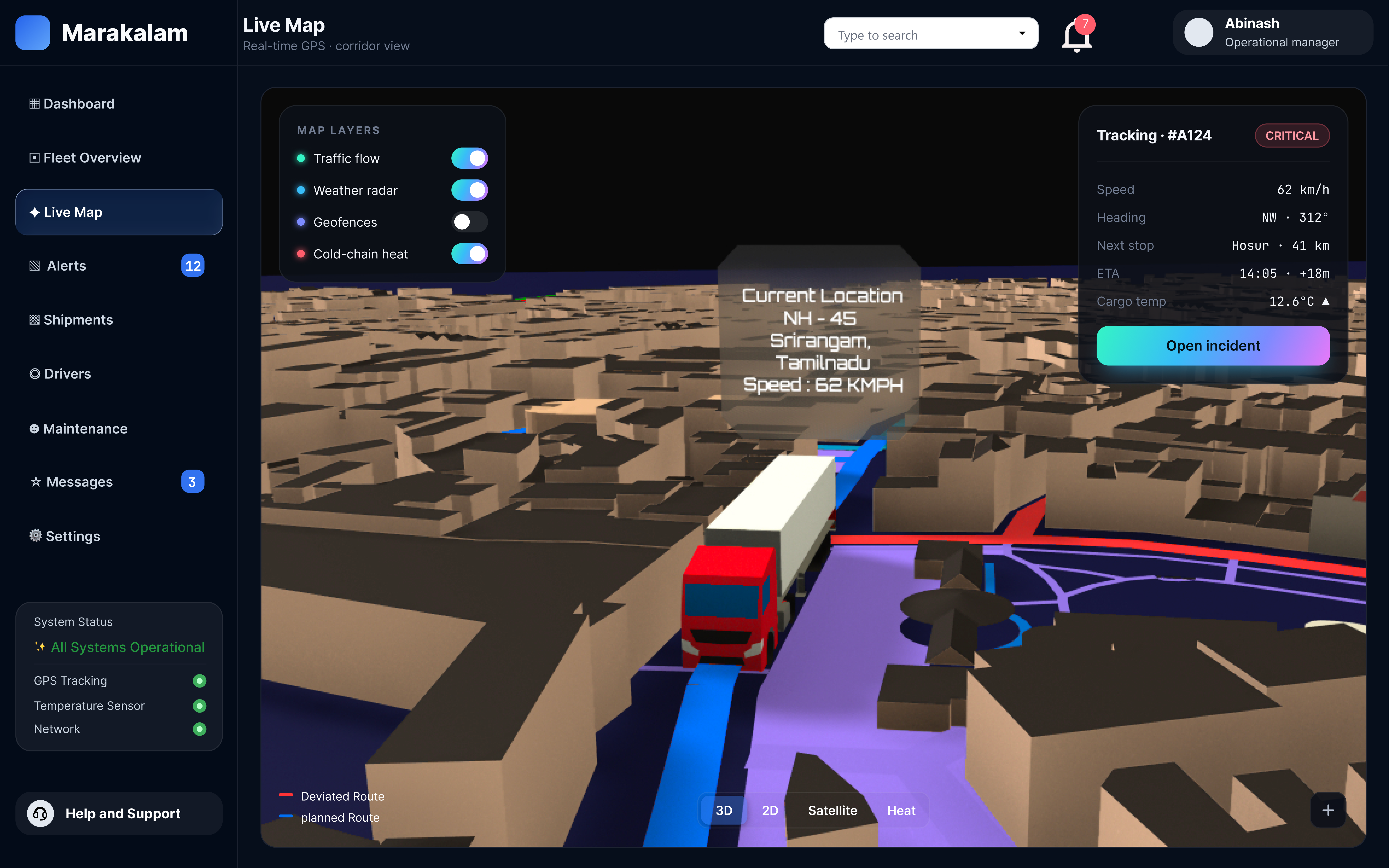
The final dark UI: navy base, status colours, gradient brand moments and the 3D live map.
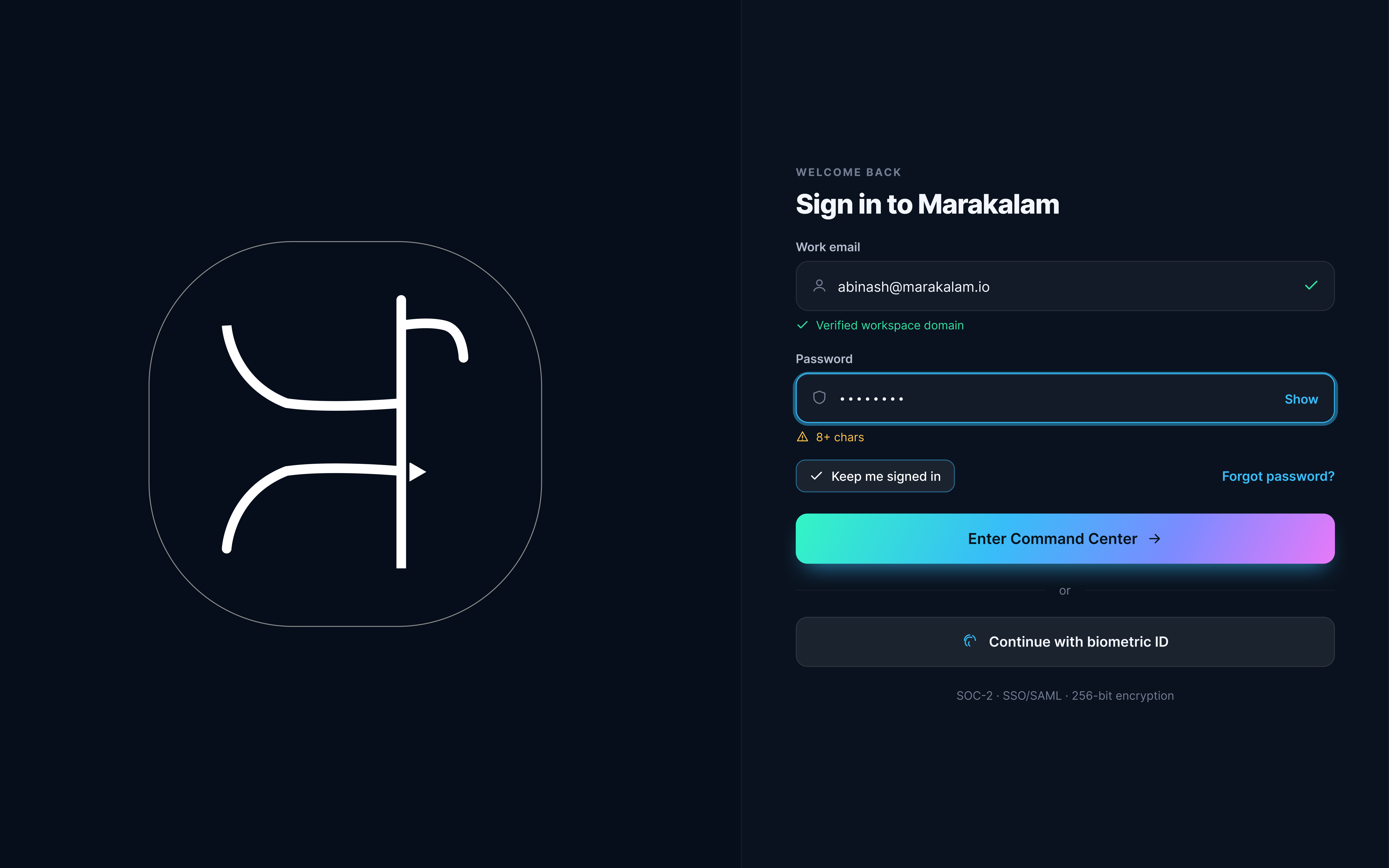
Sign in
Dashboard
Fleet Overview
Live Map
Alerts & Incidents
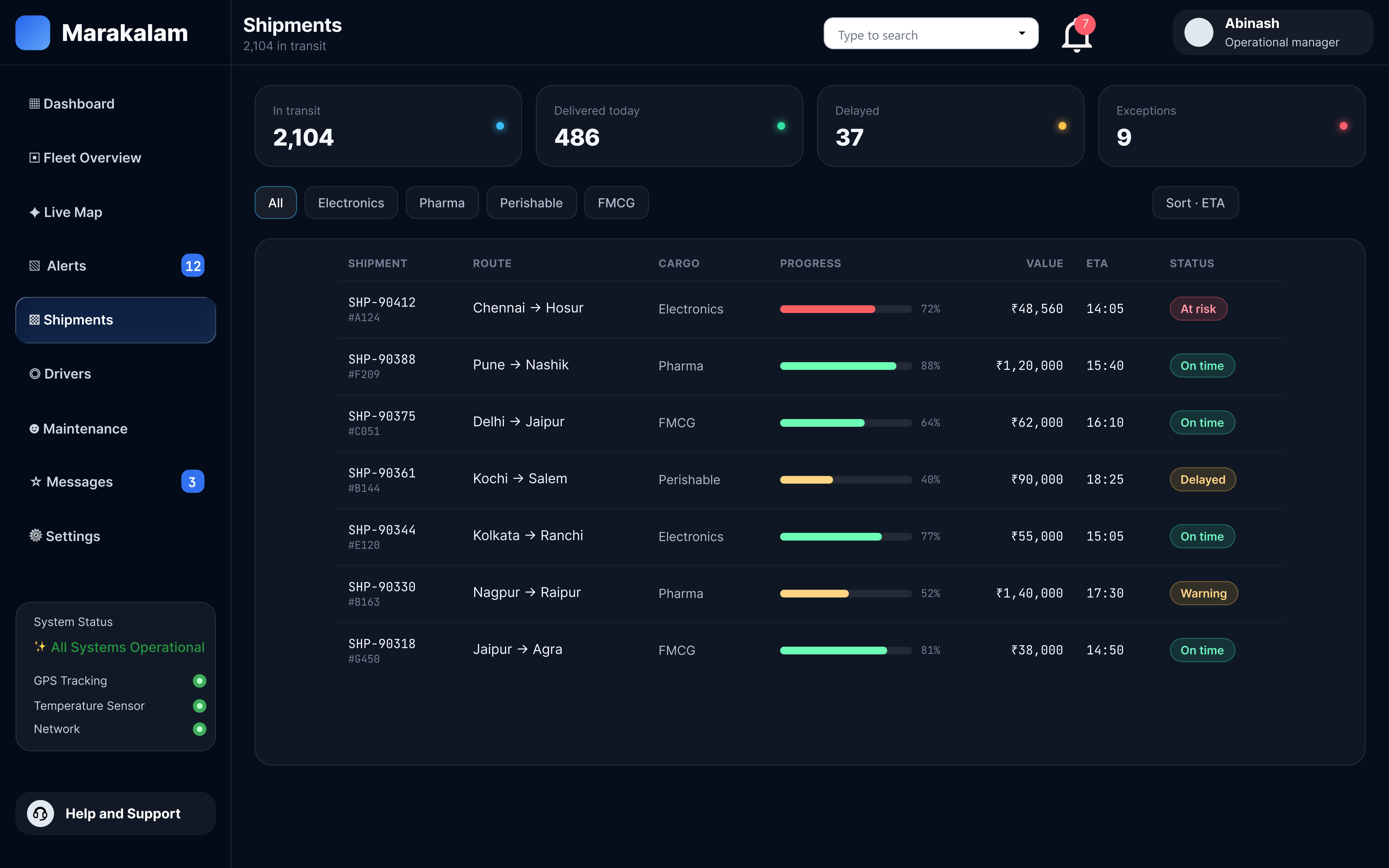
Shipments
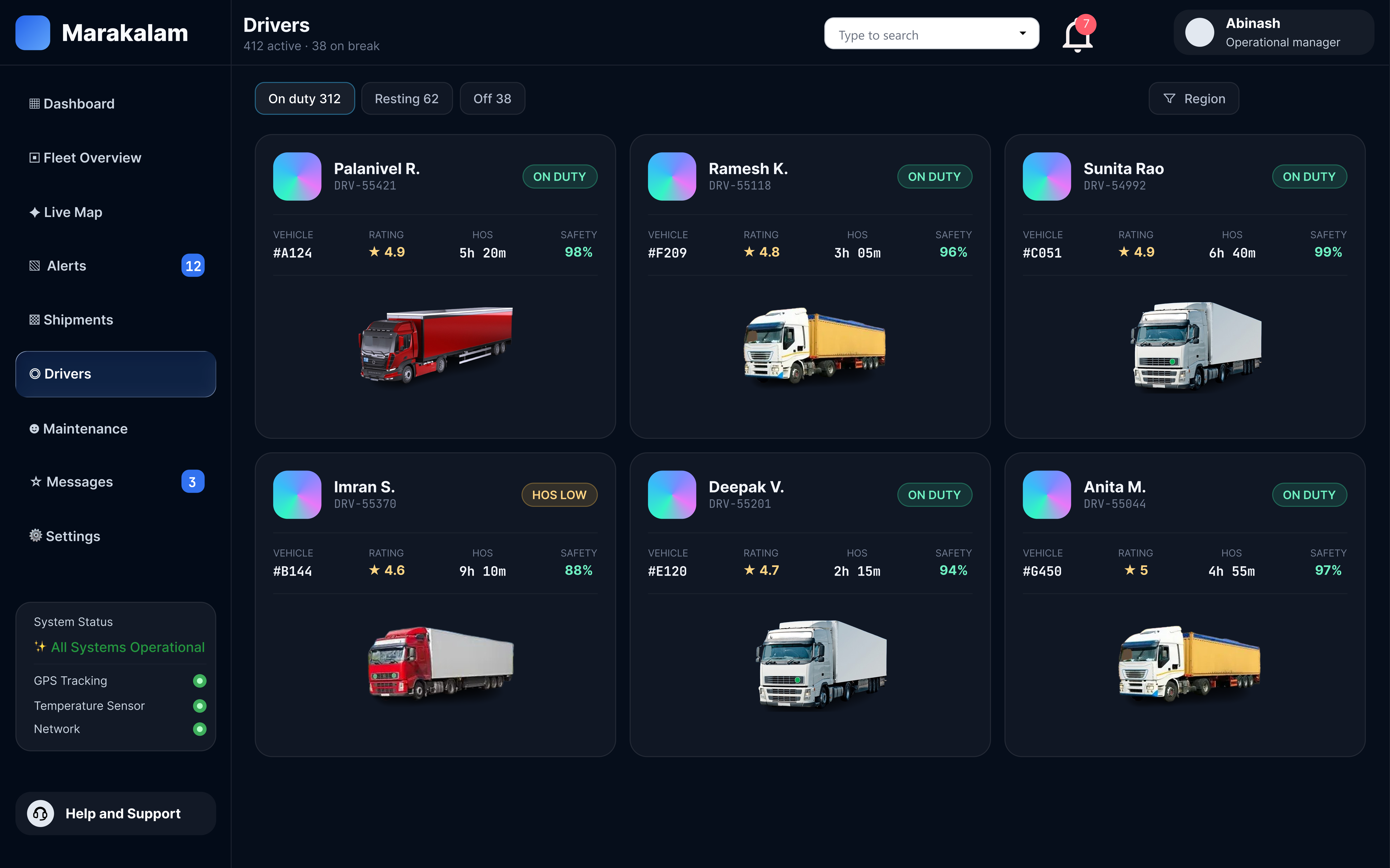
Drivers
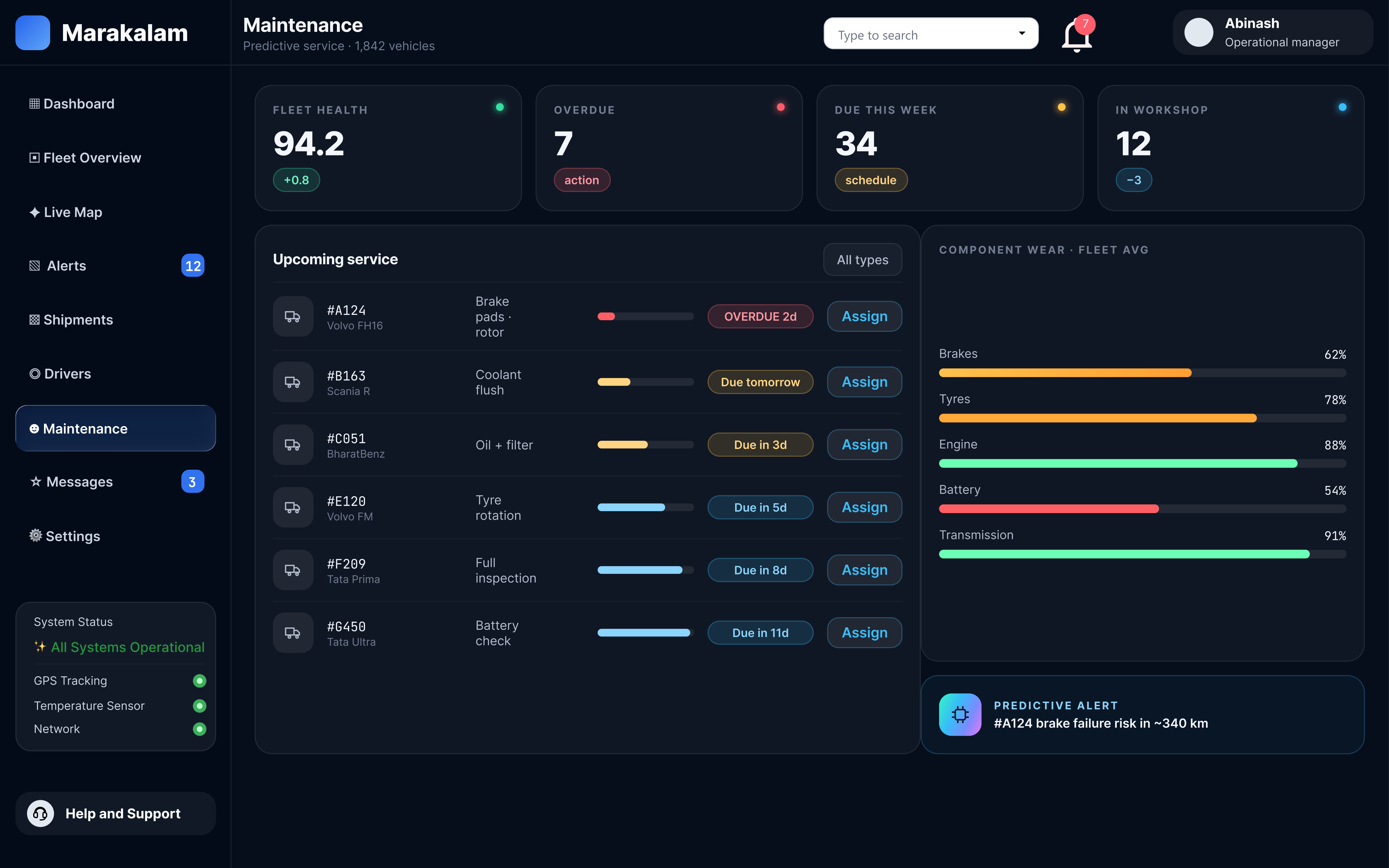
Maintenance
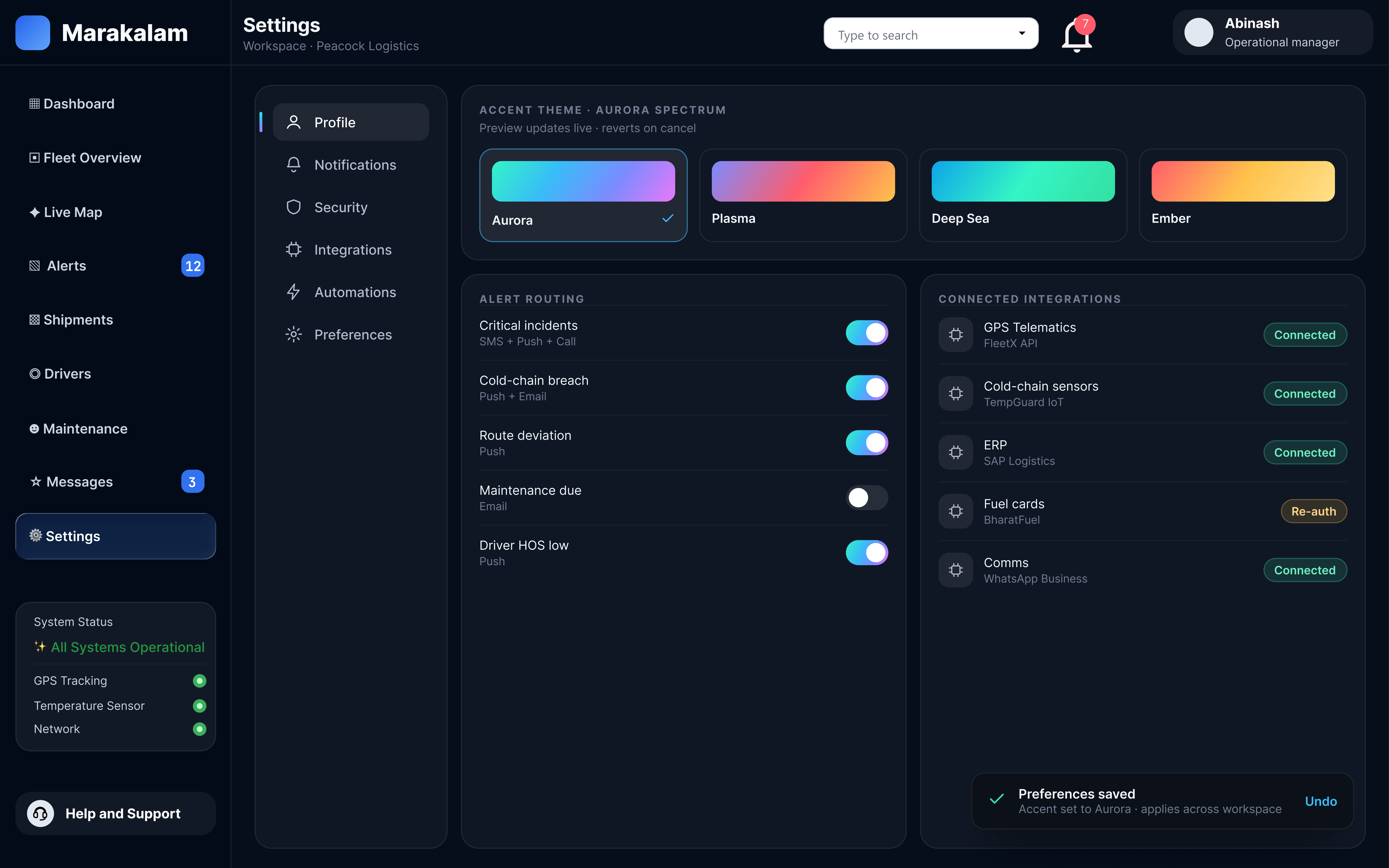
Settings
Design system
Tokens and components
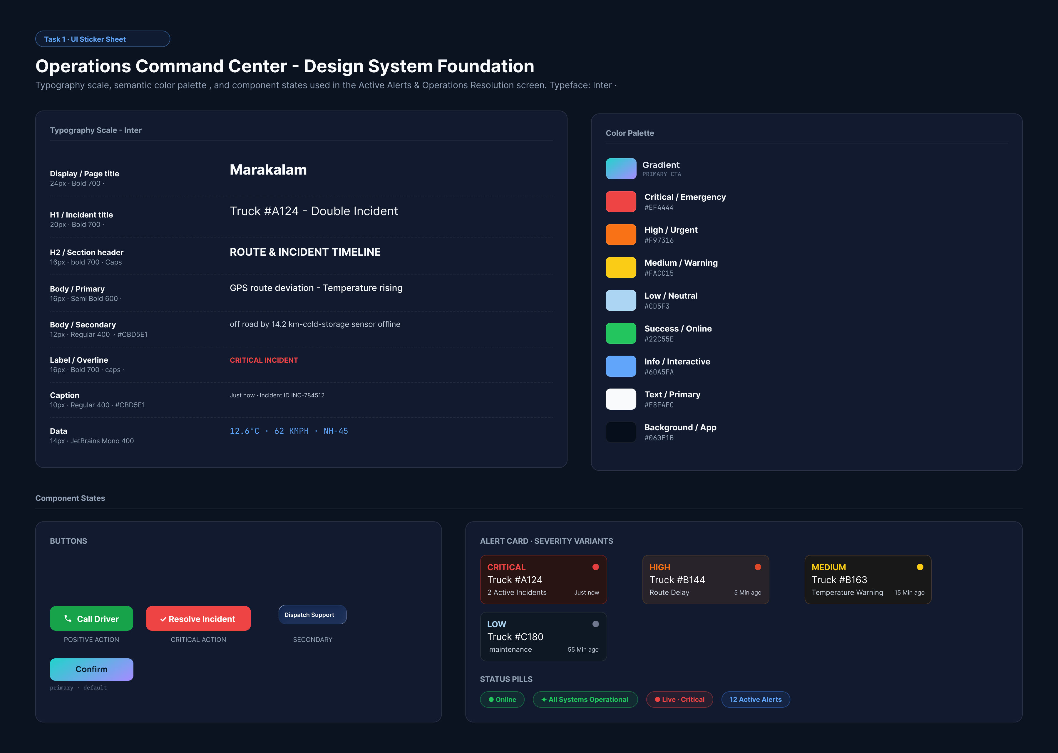
A deep navy base keeps the map and data in front. One blue marks selection and focus; a cyan to violet gradient is saved for brand moments and hero numbers; and status colours only ever mean status.
Final screens
Key moments, up close
A deep navy base keeps the map and data in front. One blue marks selection and focus; a cyan to violet gradient is saved for brand moments and hero numbers; and status colours only ever mean status.
Alerts & Incidents. Severity queue, incident map and route timeline, with Call Driver and Send Message one click away.
Live Map. A 3D road view with toggleable layers on the left and the selected vehicle's route, speed and cargo pinned on the right.
Maintenance: Fleet health score up top, upcoming service as a list, cost breakdown alongside.
Final prototype
Click through it
Start here. The prototype opens on the sign-in.
The Figma prototype links every sidebar module and walks the full alert-response flow end to end.
Screens
Modules
Primary flow
Theme
9
8
Alert response
Dark
Outcome
What I'd take forward
Marakalam puts the whole fleet on one screen and turns an incident into a three-click response.
Structure first paid off. Locking the sitemap and alert flow before visuals meant the hi-fi pass was about clarity, not rearranging.
Reserved colour does the work. Keeping red, amber and green for status only makes a critical truck stand out on a busy dashboard.
Next steps. Test the alert flow with working dispatchers, design a tablet layout for yard supervisors, and add a light theme for daytime offices.