Air Sense
Guard.
[UI/UX Design]
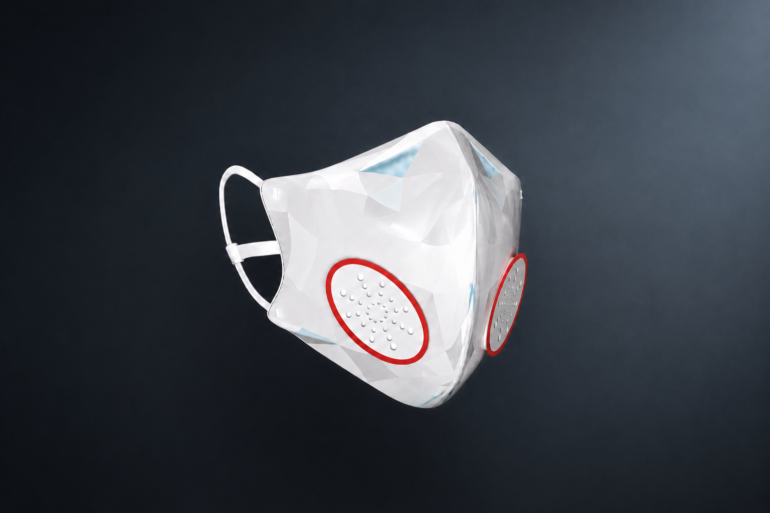
A companion app for a smart mask that reads the air on both sides of the filter: what the street offers, and what actually reaches your lungs.
[UI/UX Design]
A companion app for a smart mask that reads the air on both sides of the filter: what the street offers, and what actually reaches your lungs.
[Type]
Self-initiated case study
[Role]
UX research, interaction design, UI design
[Platform]
Mobile app for a smart mask
[Tools]
Figma
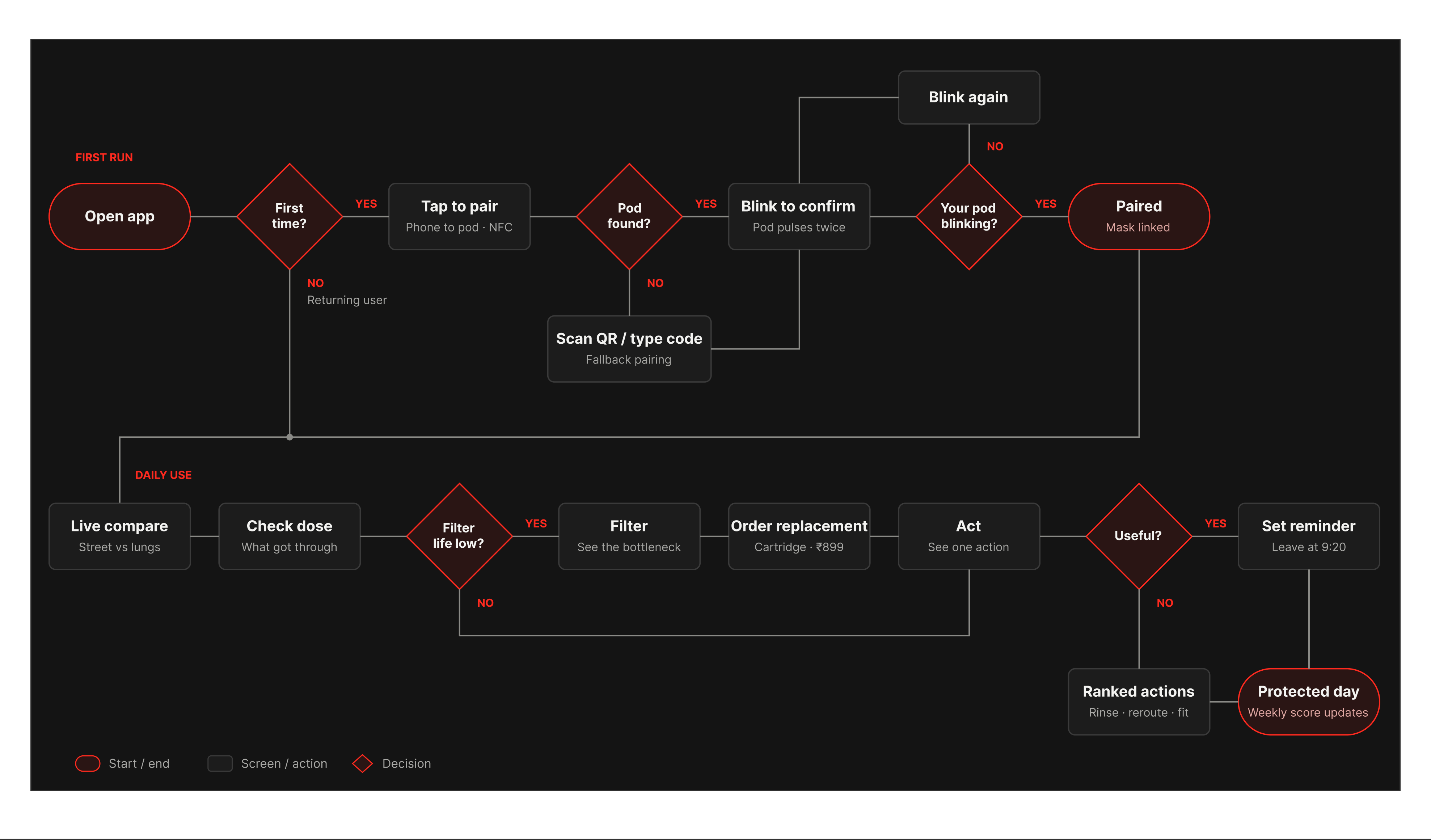
The full flow. Eight screens from pairing the mask to one daily action.
[Split at the membrane]
Two sensors: one reads the street, one reads the air behind the filter. Every screen is split at the membrane: the street above, your lungs below.
Air pollution is invisible. A mask can't tell you how bad the air is, or whether it's actually protecting you.
[Challenge]
People wear masks without knowing how dangerous the air is right now, how much the filter is stopping, or when it needs replacing. Without feedback, protection feels optional.
[Goal]
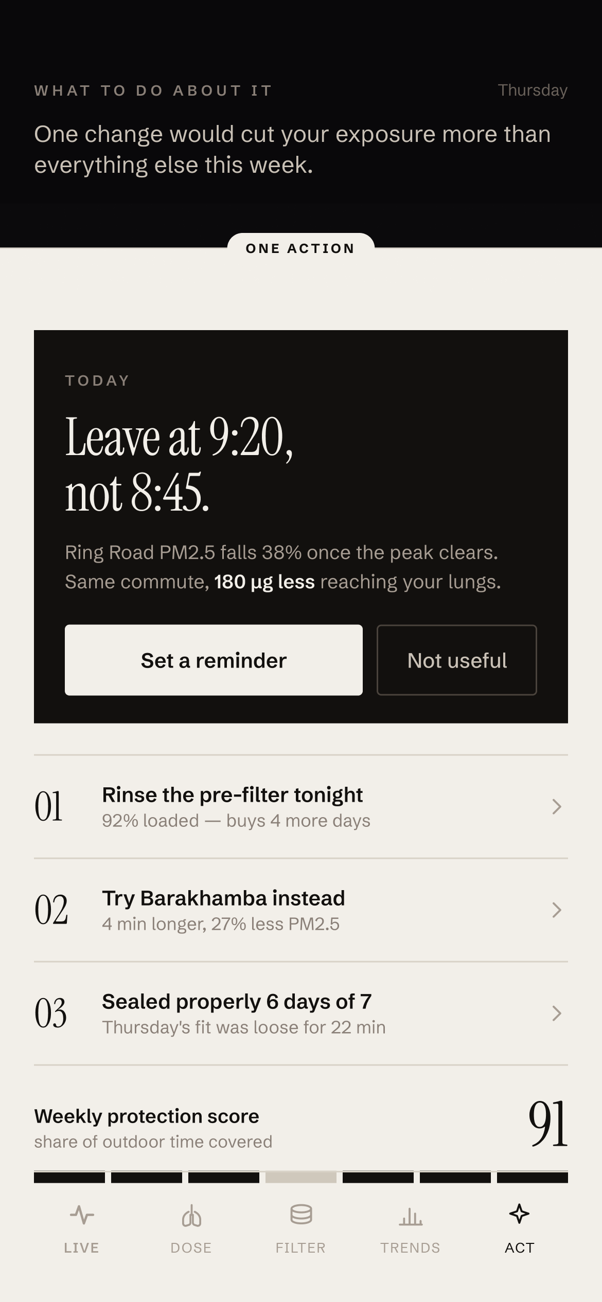
Show the difference the mask makes in numbers people can feel, and turn it into one clear thing to do each day.
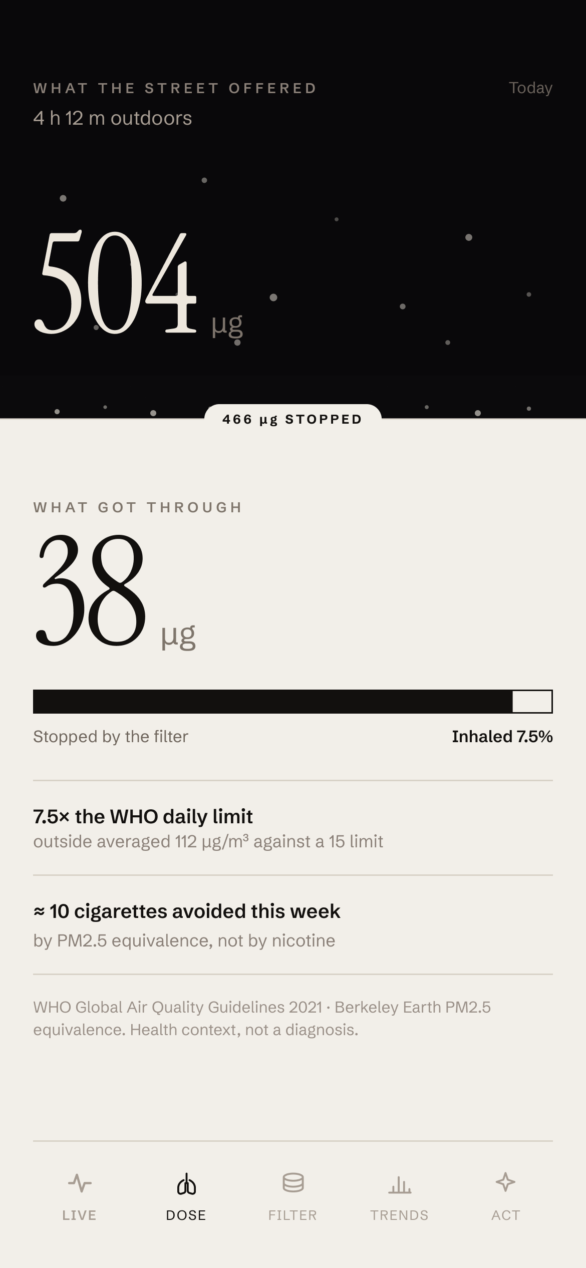
Instead of one number, every screen shows two, separated by the filter itself. The dark half is the street; the paper half is what got through. The gap between them is the story.
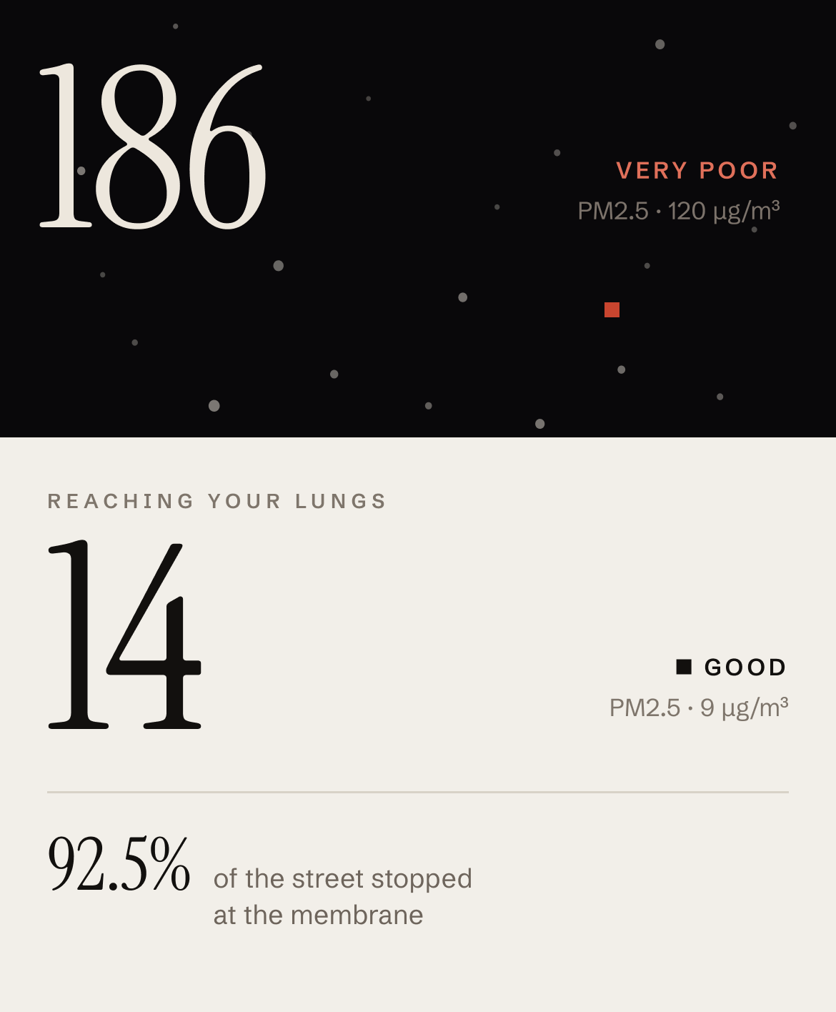
[ABOVE]
Night. The outside world: street PM2.5, exposure time, what the air offered.
[BELOW]
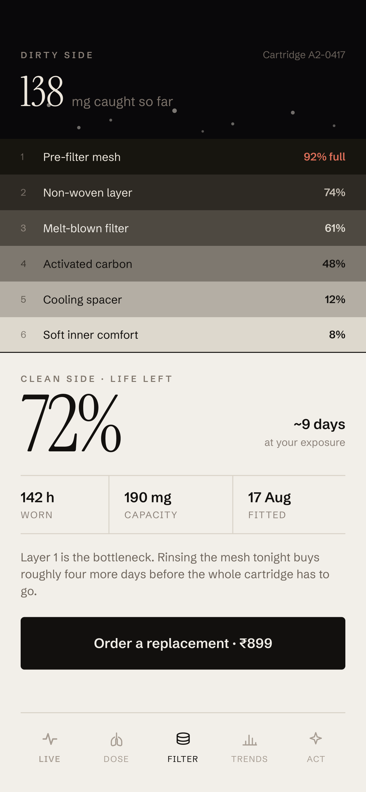
Paper. Your side of the filter: what you breathed, comfort, fit and filter life.
I designed around the people who would wear the mask every day. Their needs shaped what each tab shows first.
Daily commuter. Walks and takes public transport through busy roads. Wants to know what the trip cost them and how to make tomorrow's cheaper.
Outdoor worker. Wears the mask for long hours, often with gloves on. Needs setup with no typing and filter alerts before it's too late.
Careful city resident. Wants to stay safe without feeling anxious. Needs clear, honest numbers instead of confusing pollution data.
[Principle 01]
Street above, lungs below. The same split on every screen, so the layout itself explains the product.
[Principle 02]
Meaning beyond colour. Rhythm, labels and shapes carry state too, so it still reads if you can't tell red from green.
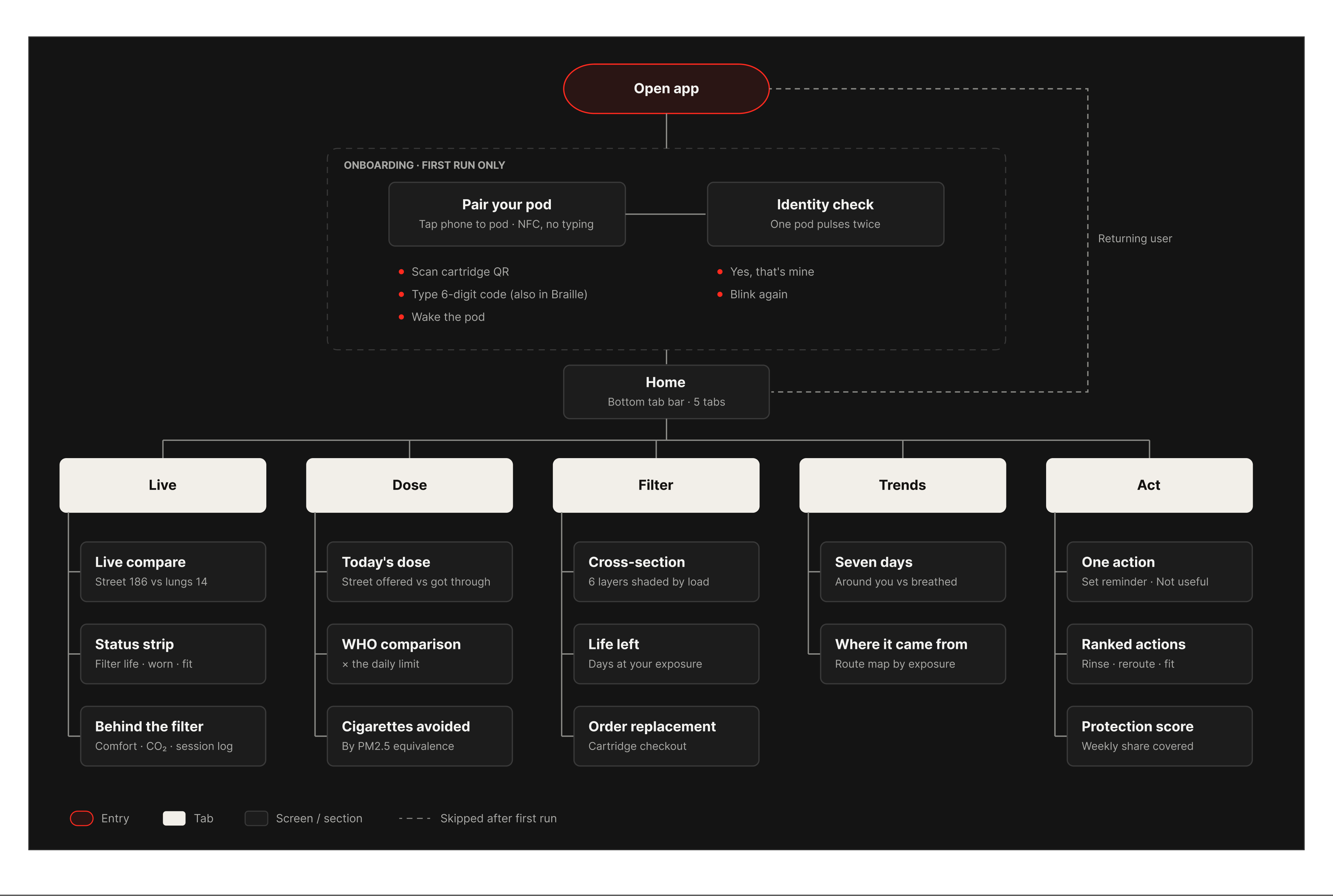
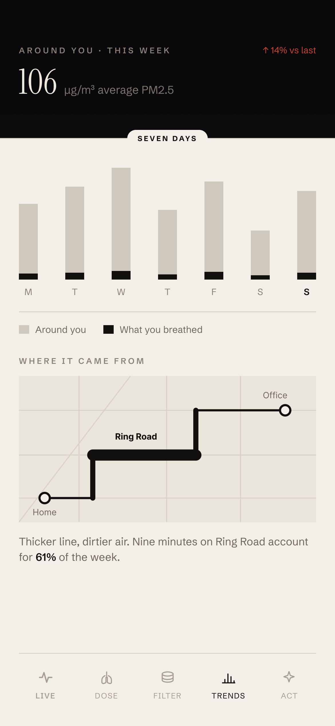
A two-step onboarding, then five tabs that follow a simple arc: see it live, count the dose, check the filter, spot the pattern, act on it.
Pairing is the first moment of trust. I kept it to two steps, with no typing by default and a physical check that proves you paired your own mask, not one nearby.
Greyscale layouts to lock the split: a dark band for the street, a light panel for the lungs, and the tab bar.
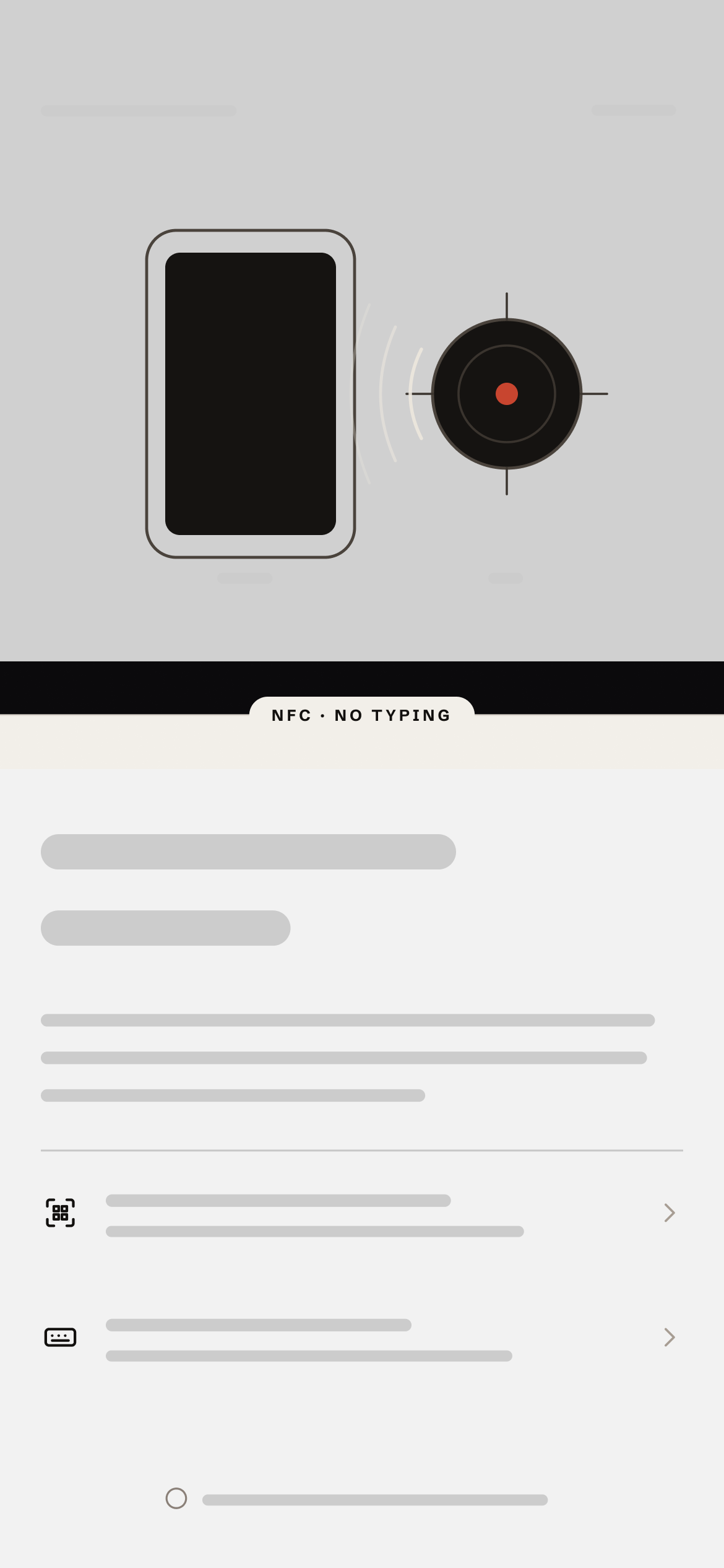
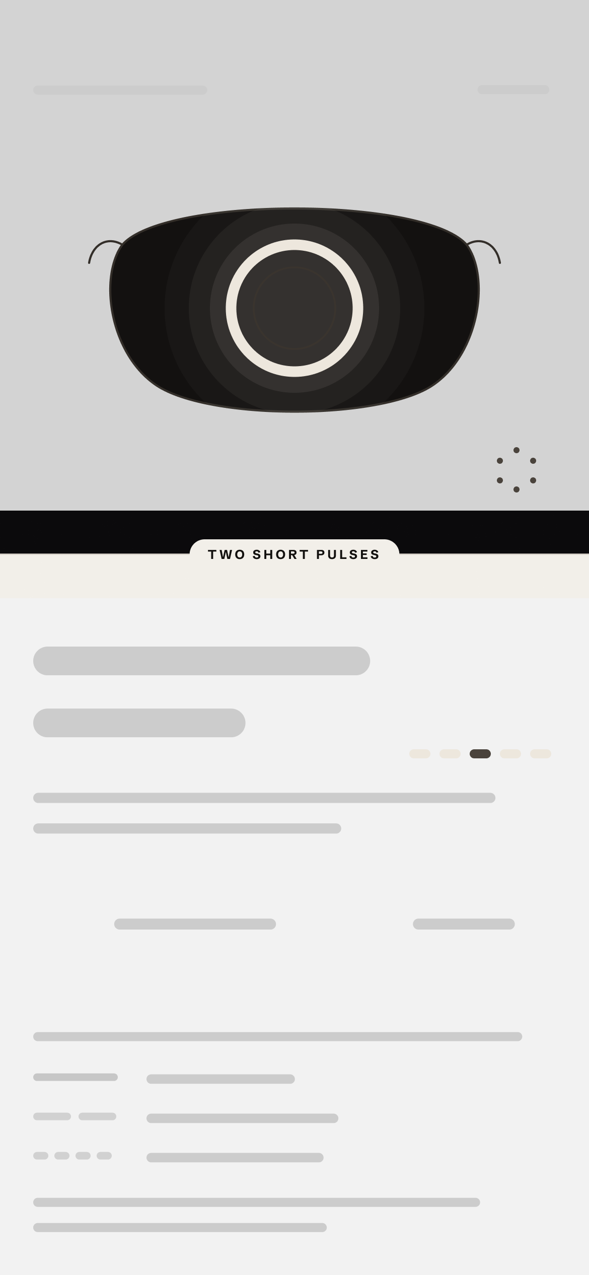
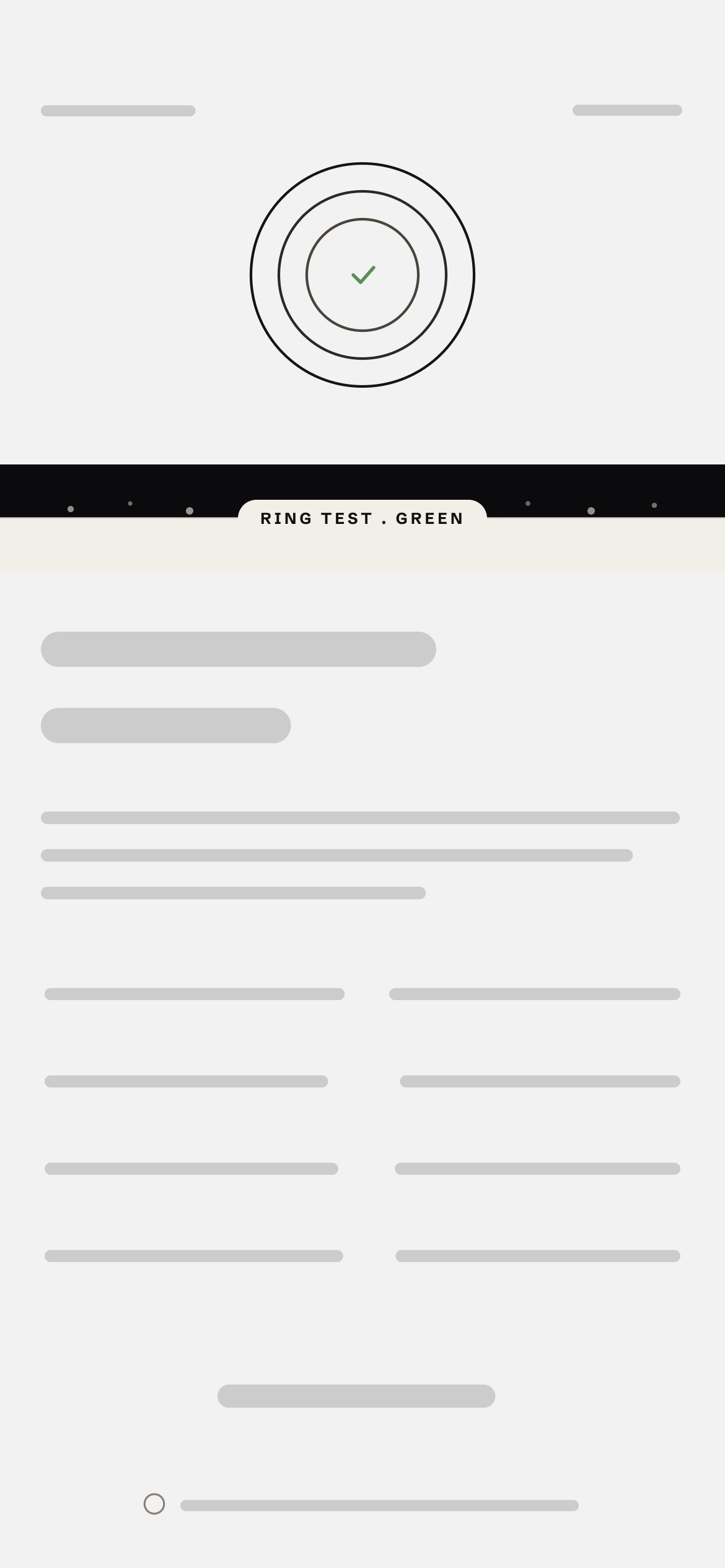
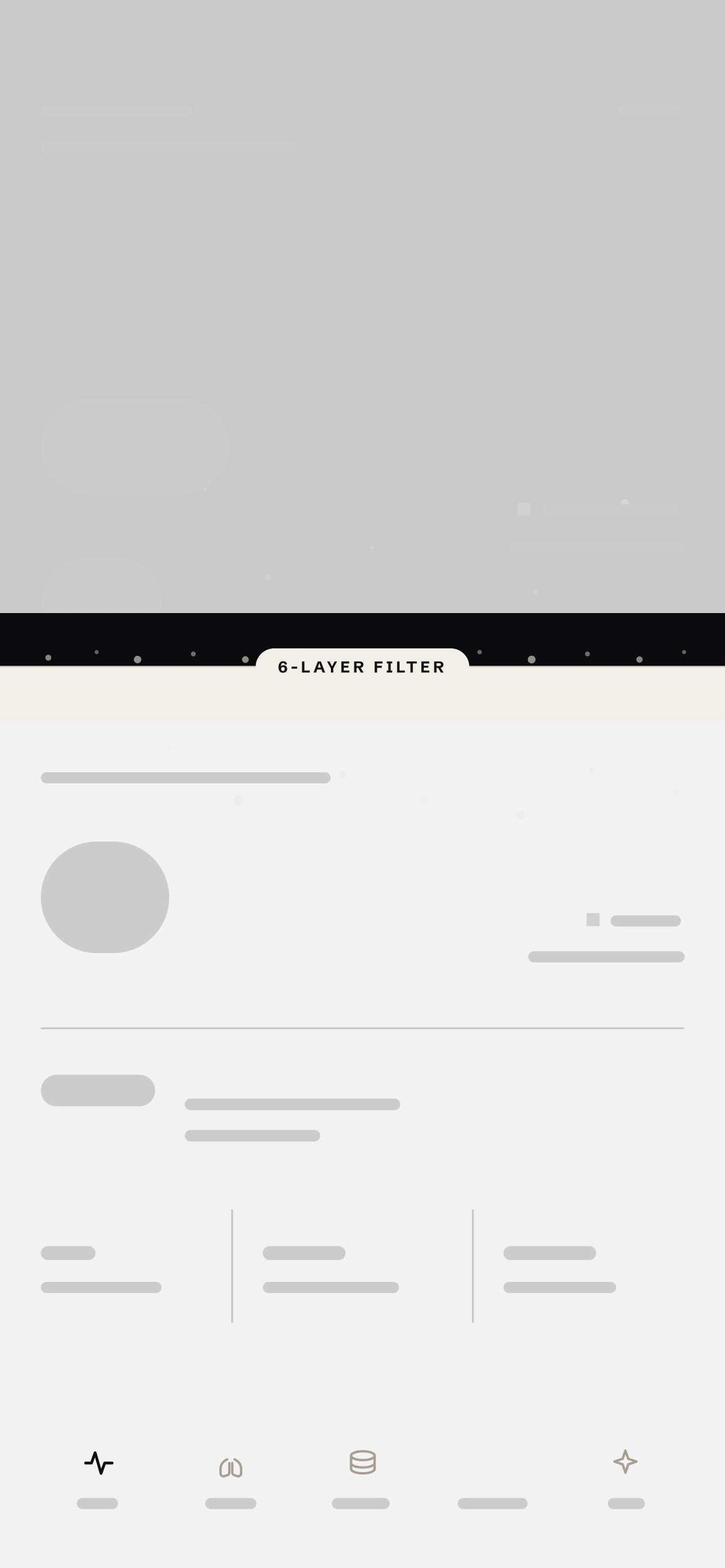
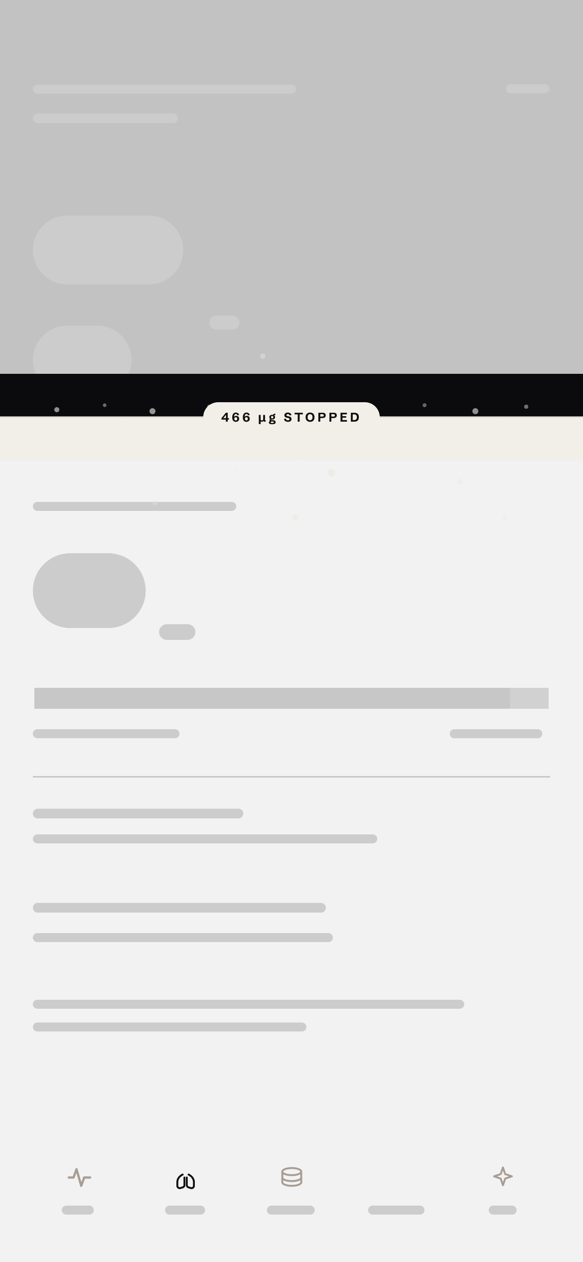
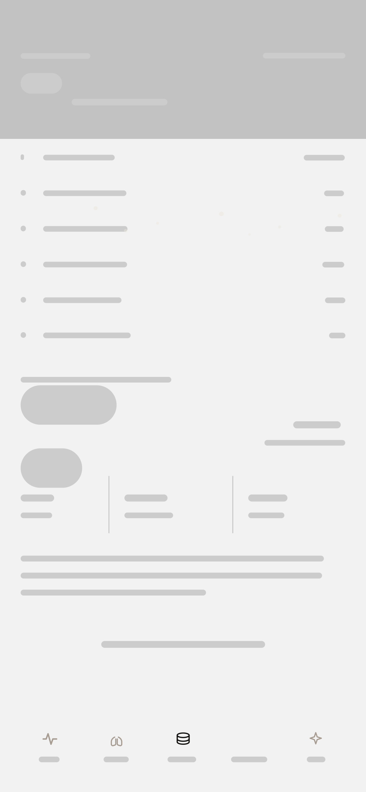
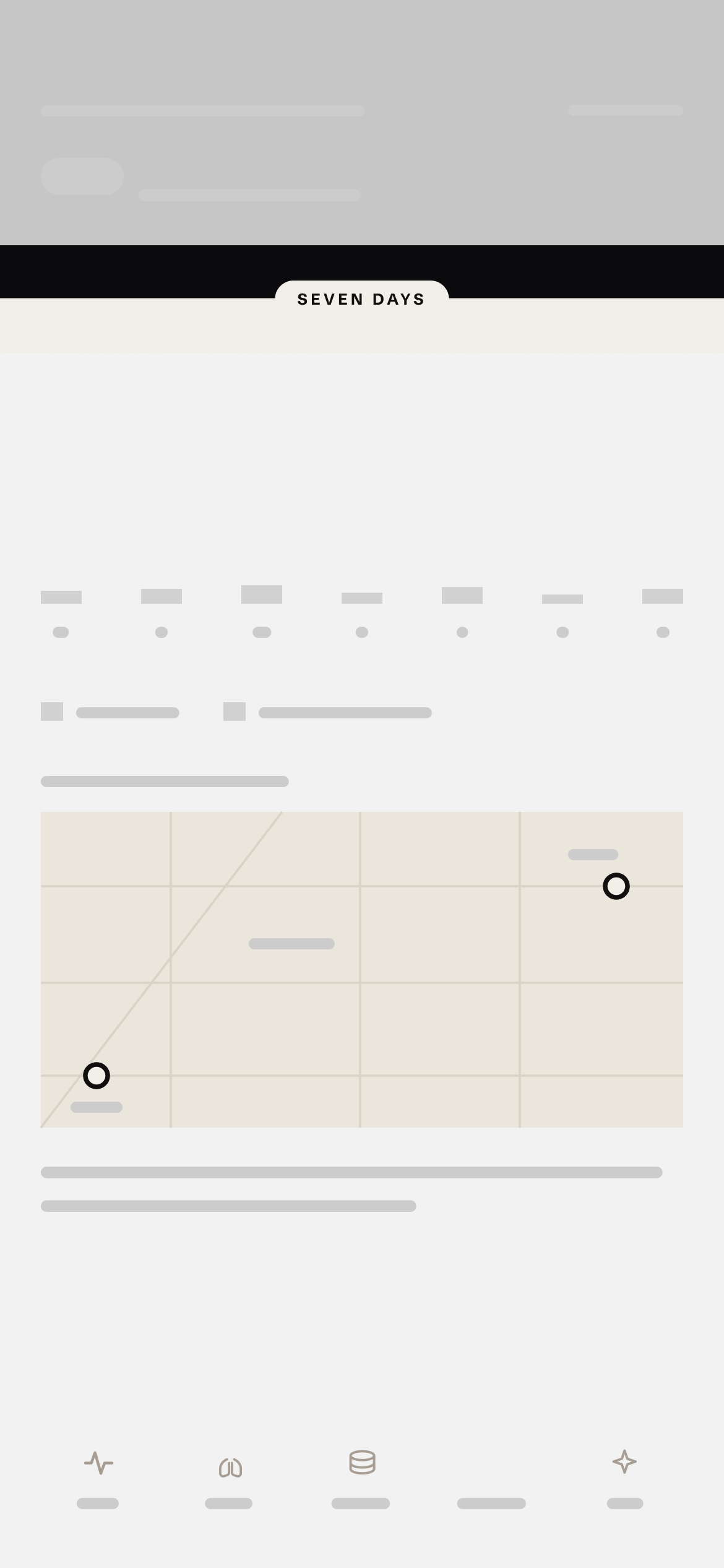
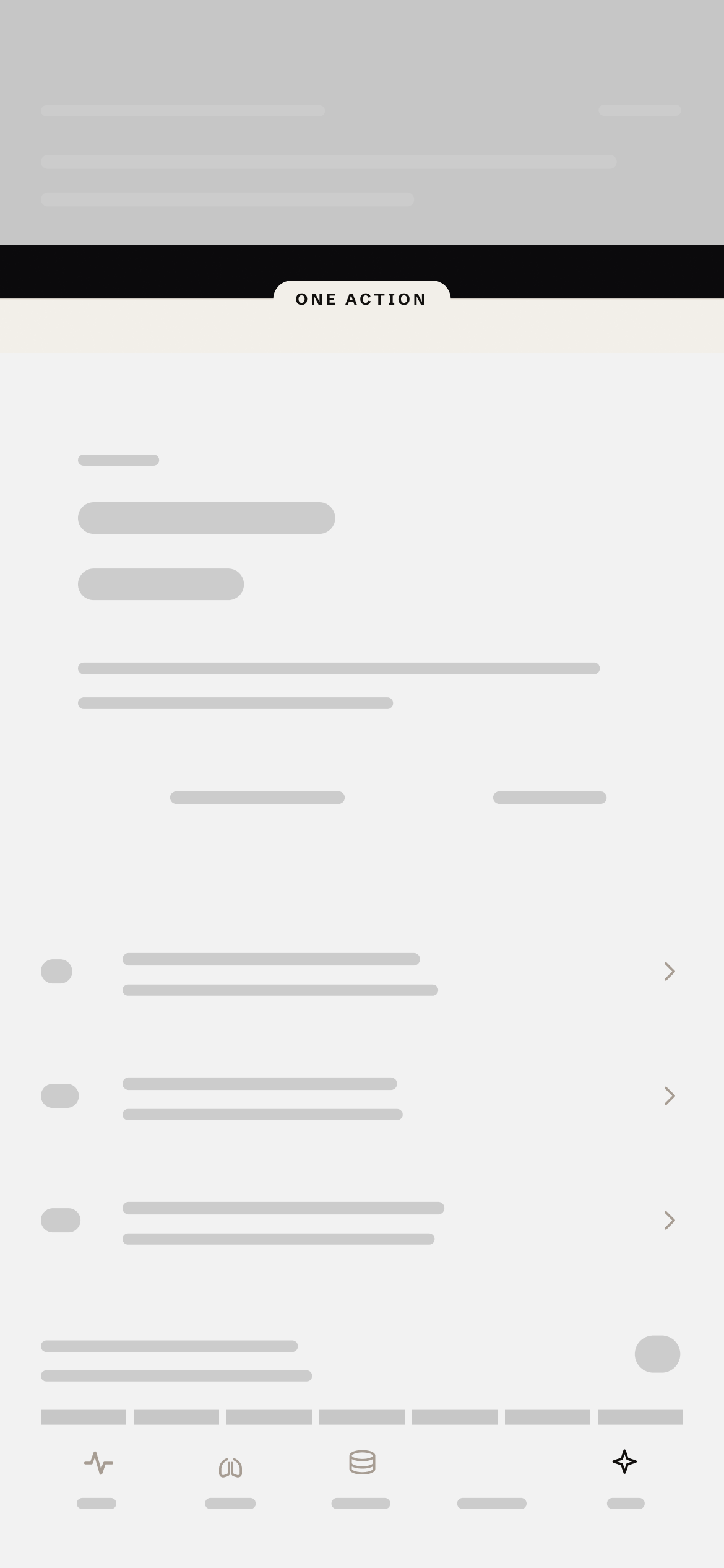
Real labels and numbers. The stat rows, layer list and action cards take their final shape here.
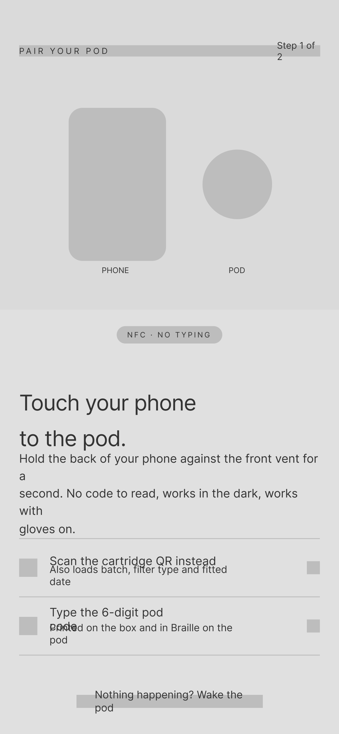
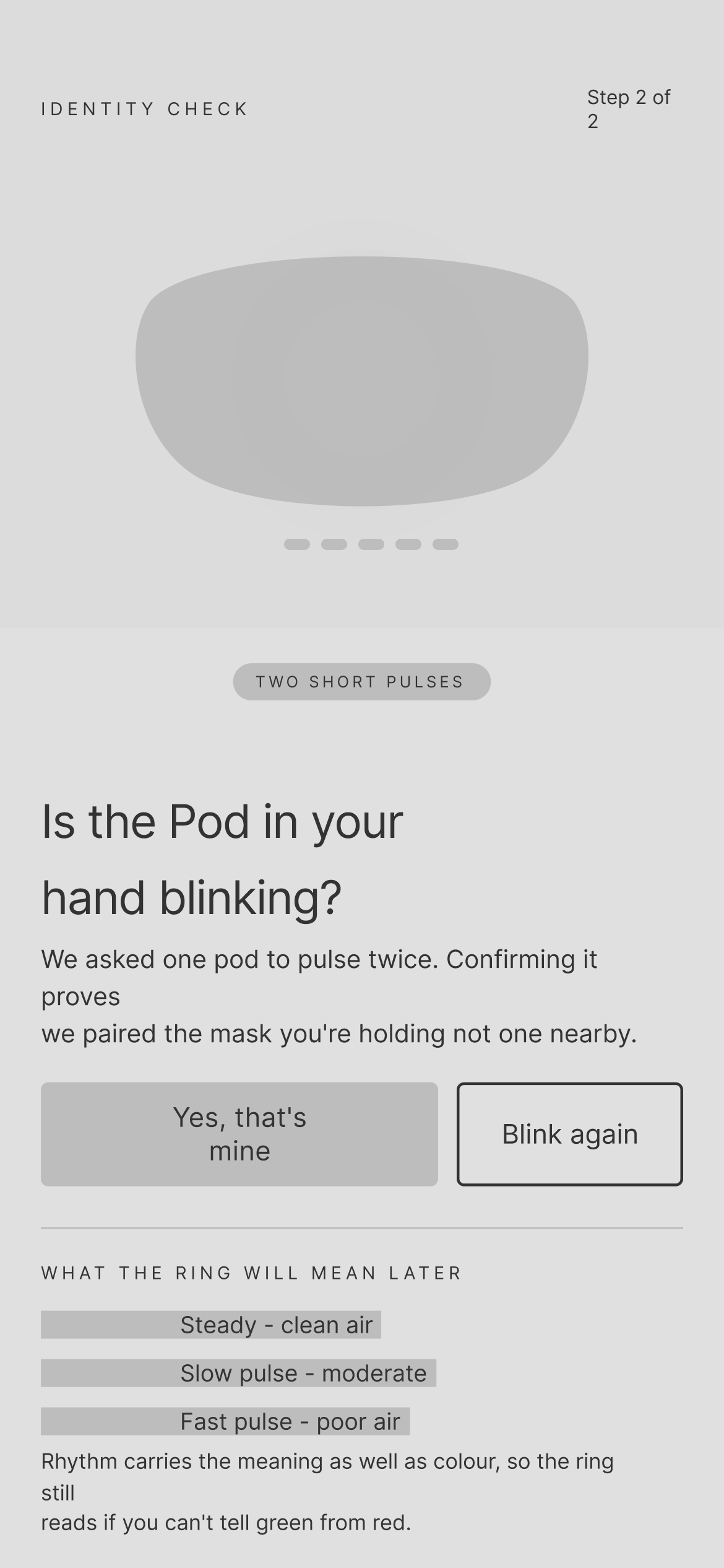
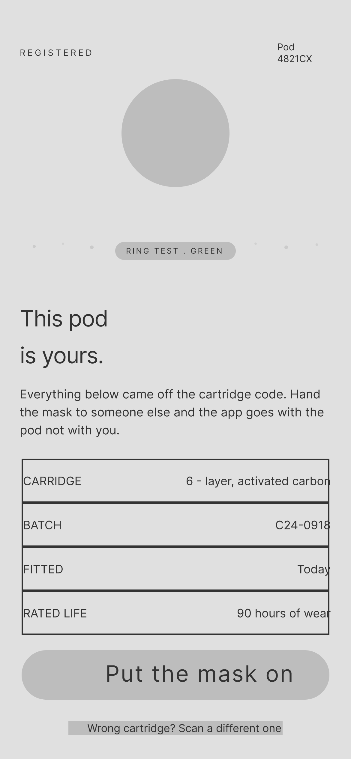
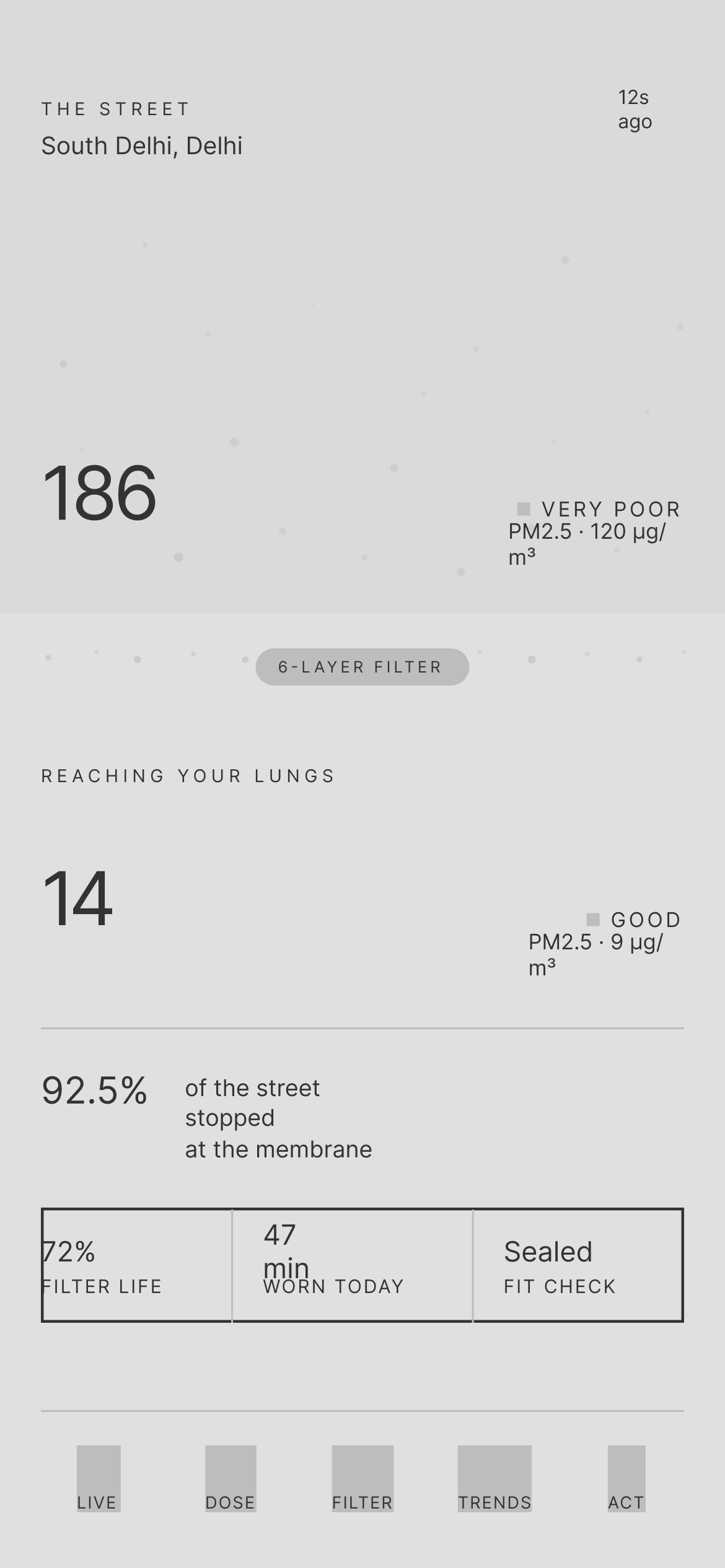
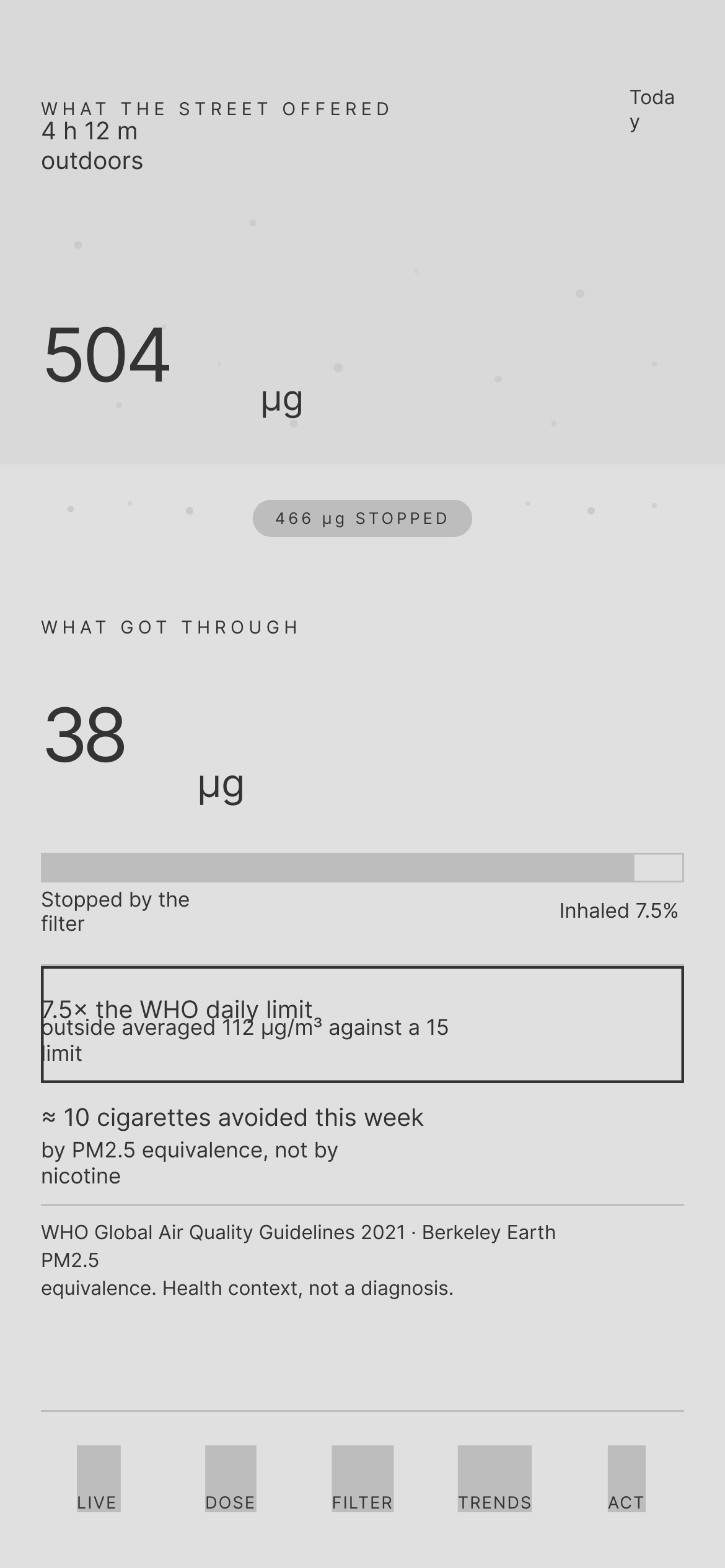
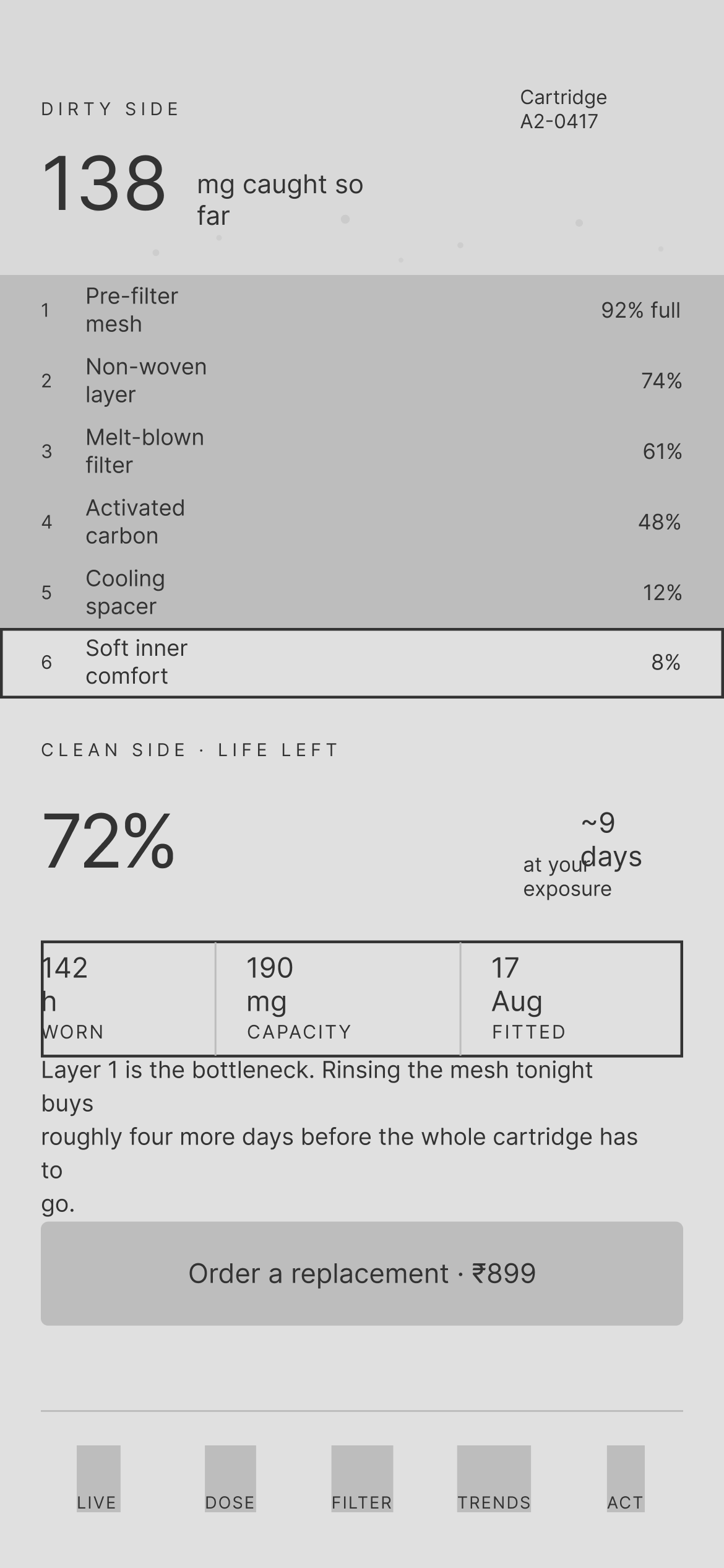
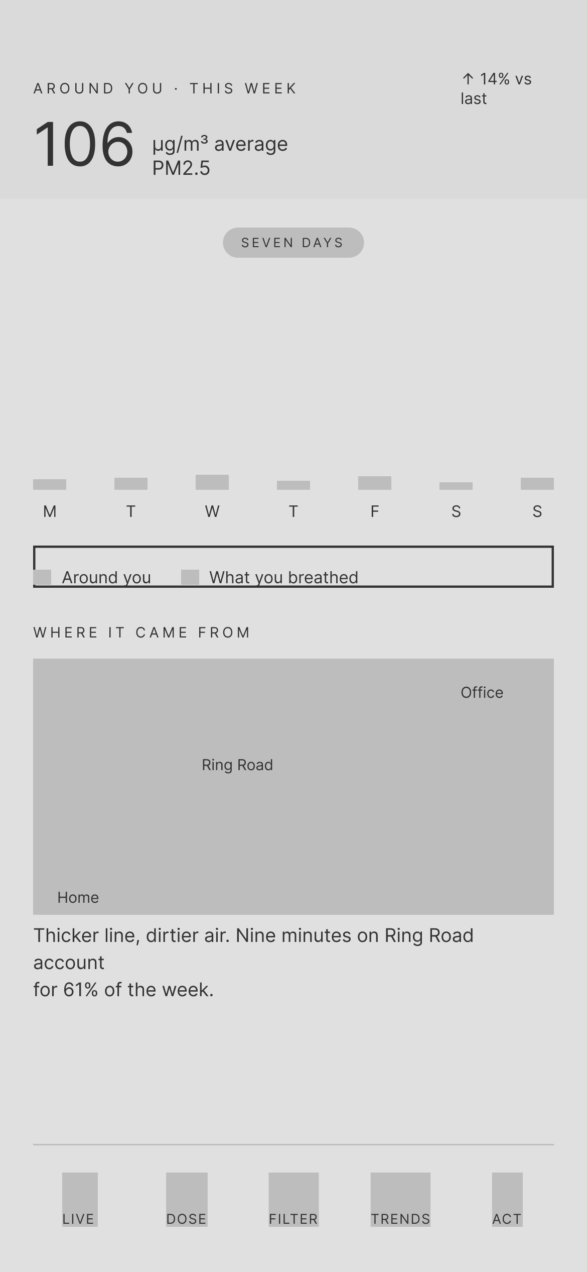
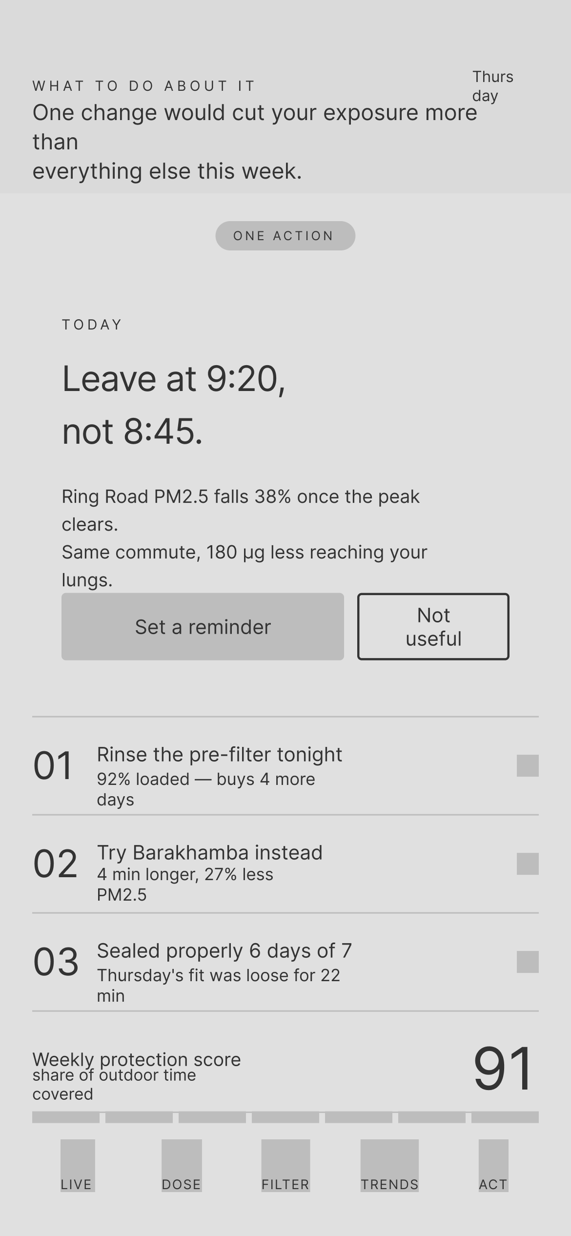
The finished night-and-paper UI, with serif numerals, the membrane pill and red kept for poor air.
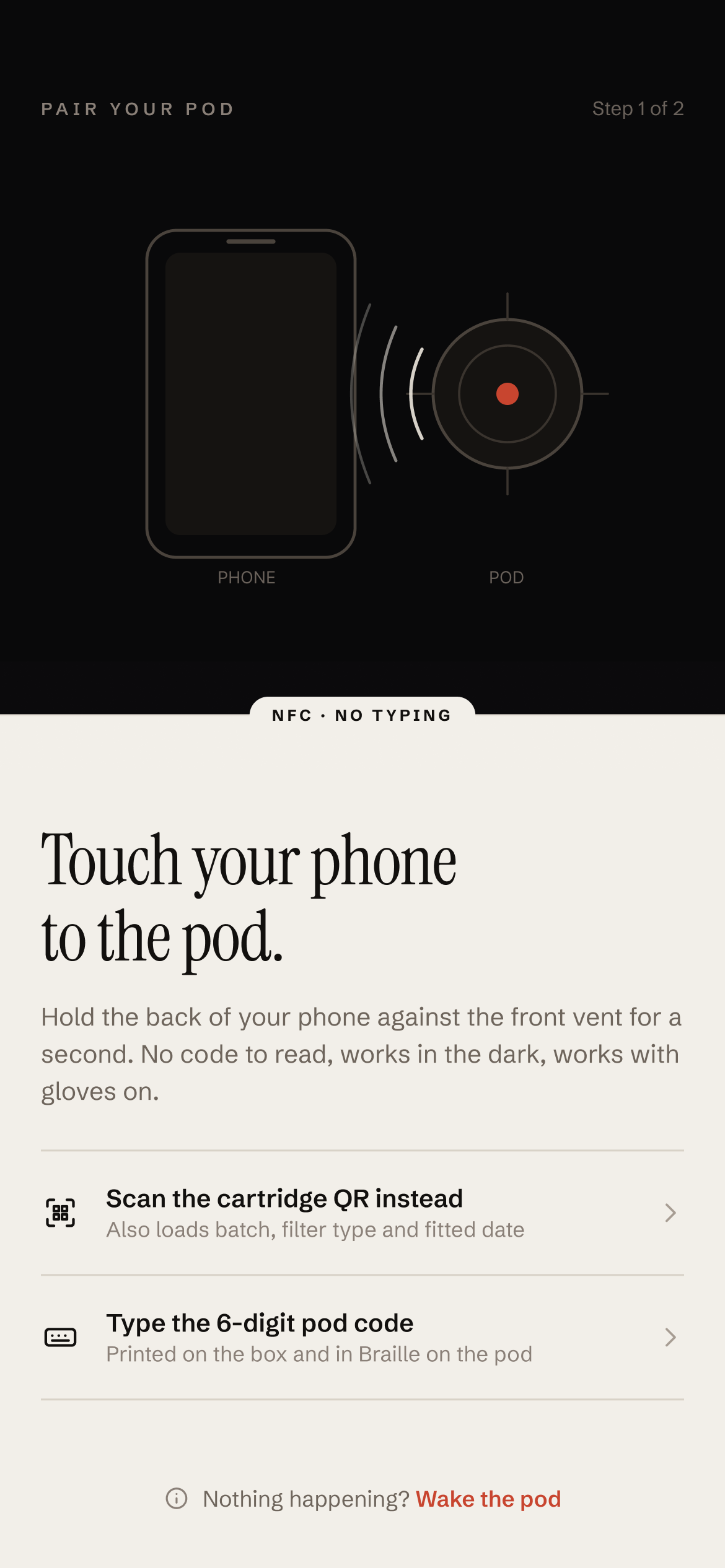
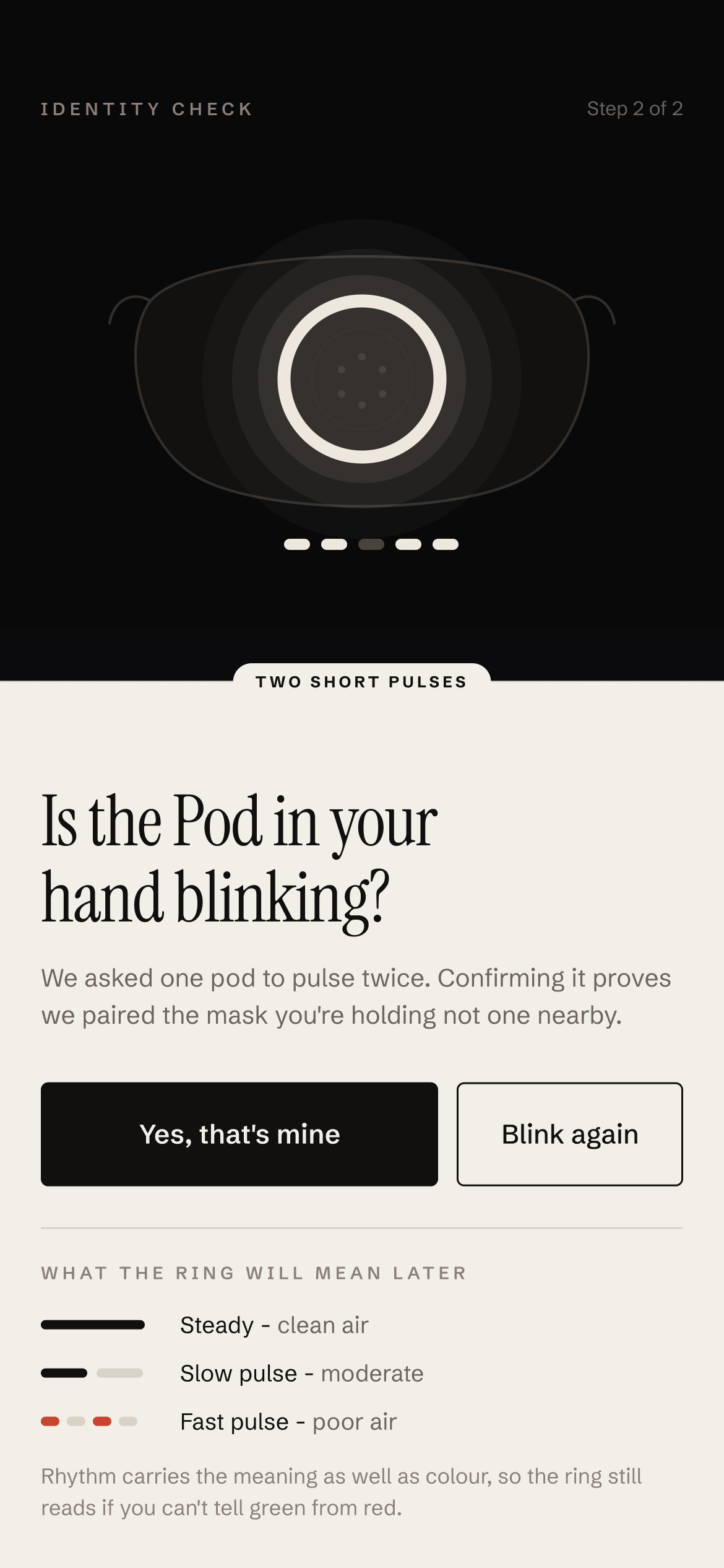
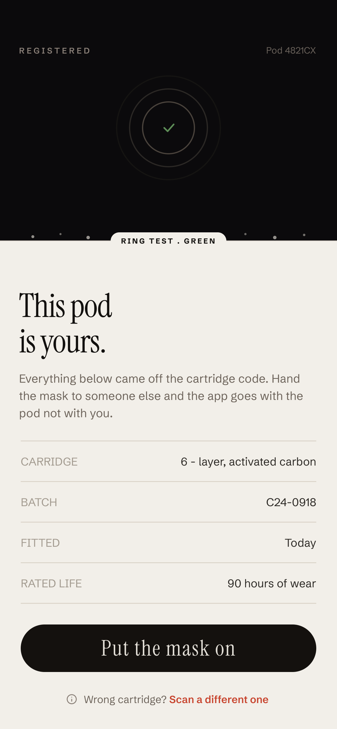
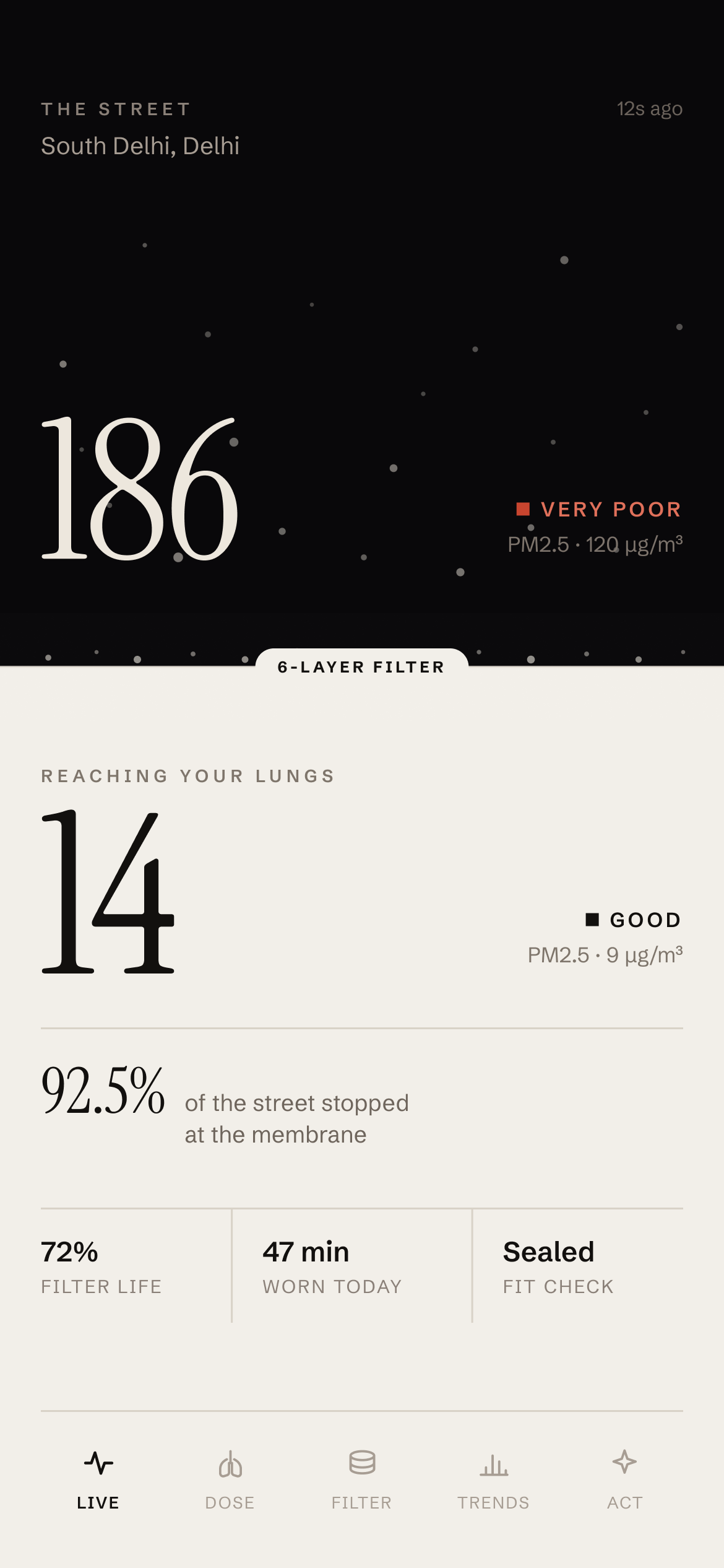
Start here. The prototype opens on the sign-in.
The Figma prototype runs from pairing through all five tabs, including the filter reorder and the daily action.
Air Sense Guard turns an invisible filter into numbers you can feel: 504 µg offered, 38 µg breathed.
A layout can explain a product. Splitting every screen at the membrane makes the mask's value obvious without extra copy.
Inclusive by default. No-typing pairing, Braille codes and rhythm-based states help everyone, not only edge cases.
Next steps. Test pairing with people wearing gloves, validate the comfort score with real readings, and design a watch glance view.